![]() »
»
[ Box updated on August 7th, 2008 ] [ original ]
 Naruto: Rise of a NInja Box Cover Comments
Comment on Ayron's Naruto: Rise of a NInja Box Art / Cover.
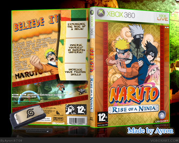
Finally, i got 'round to making a naruto box!
Countless times have i tried making one,
yet never did i succeed.
After about 20 layouts, i DID succeed for once, and i hope you enjoy this box as much as i did making it.
I have no clue whose template it is, i found it in the summer comp's thread.
Credit to Vidboy,Liam and the people in my WIP thread for helping me during the process of this box.
comments/criticism/feedback highly appreciated!
Enjoy!
-Ayron
Edited at 1 decade ago
[ Reply ]
Awesome mate. :)
[ Reply ]
This is really cool!
[ Reply ]
Mm, it was tasty. =) (See W.I.P. Thread)
[ Reply ]
Woah! Now that is just downright awesome!
[ Reply ]
Banner is much too large, but it's very nice. If you shrink, and put bullets closer to each other, then more room for text, Naruto, and screens. 4/5+fav
[ Reply ]
i really like this. fav
[ Reply ]
i love naruto +fav
[ Reply ]
I don't like anime Naruto, i only like the manga really, so when I clicked on this I was like, "Not Naruto." But I love this! The games are actually pretty fun, and my favorite part of this box is the shadow you have under the scroll. It gives the box depth. No believe it please, believe it.
On thing I would have to say is make your text bigger or just type more to fill out the scroll. All that white space makes the back of your box look empty.
[ Reply ]
Well done!
[ Reply ]
i like it :D you fixed the clouds ;)
[ Reply ]
nice
[ Reply ]
your awesome Ayron FAVE
[ Reply ]
What's up with the spine? I think you got the sizes on Imandix wrong, it looks too thin. You could also do with moving the main logo up a little so the 12+ and Ubisoft logos have some space to breathe. And that scroll-looking thing on the back looks awfully boring, you probably could've put the screenshots there instead of that huge strip which takes up a lot of the back, and maybe then put the captions on top of them, if you get what i mean.
[ Reply ]
I'd move pegi and ubisoft logos a bit up but looking good!
[ Reply ]
I dont even like Naruto!! I actually find it pretty lame... HOWEVER the box looks awesome and very official looking so fav!! My only nitpick is the things what Ervo said.
[ Reply ]
I faved it...
BELIEVE IT
[ Reply ]
Congrats Ayron! Well deserved. :)
[ Reply ]
Front is fantastic! I especially love the colors. Sweet job, dude. ;)
[ Reply ]
If only my Naruto box was this good. 5/5 +fav
[ Reply ]