[ Buy WWE Raw at Amazon ] By Mr.Fantastic09 1 on October 13th, 2008 No Printable Available [ Box updated on October 14th, 2008 ] [ original ] WWE Raw Box Cover Comments Comment on Mr.Fantastic09's WWE Raw Box Art / Cover. Cancel Reply Mr.Fantastic09 1 [ 1 decade ago ] Edited at 1 decade ago [ Reply ] Mr.Fantastic09 1 [ 1 decade ago ] my first boxart with a backk. what do you think people --and people i do all my work on GIMP. so give me a break will ya. its pretty good work for gimp in my opinion. [ Reply ] paper sonic 37 [ 1 decade ago ] Its ok but I do not like that the screenshots are red Edited at 1 decade ago [ Reply ] Weezer 9 [ 1 decade ago ] This has to be your best work. [ Reply ] Drakxxx 46 [ 1 decade ago ] #4 Absolutely. This is a HUGE improvement from your other submissions. Looks like your on the right track, keep it up! [ Reply ] sven.2007 13 [ 1 decade ago ] Pretty cool, but... the screenshots should not be red the text should not be blue you spelled "nunchuk" wrong the overall back design could be improved [ Reply ] TrevOwnz 42 [ 1 decade ago ] Center the box and make the reflection not as long and what others said. [ Reply ] Mr.Fantastic09 1 [ 1 decade ago ] updateee--i listened to what you guys said and this is how it turned out. --thanks everyone. [ Reply ] Weezer 9 [ 1 decade ago ] It seems way better than before. [ Reply ] Mr.Fantastic09 1 [ 1 decade ago ] # 9, thanks [ Reply ] ScoobyDoo352 1 [ 1 decade ago ] Now I Like This 1 More Than The Y2j One Cause I Like Cena More! [ Reply ] khrc123 1 [ 1 decade ago ] omg way cool [ Reply ]
 WWE Raw Box Cover Comments
Edited at 1 decade ago
[ Reply ]
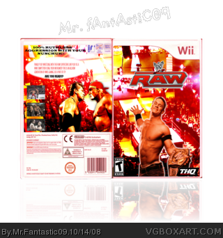
my first boxart with a backk. what do you think people
--and people i do all my work on GIMP. so give me a break will ya. its pretty good work for gimp in my opinion.
[ Reply ]
Its ok but I do not like that the screenshots are red
Edited at 1 decade ago
[ Reply ]
This has to be your best work.
[ Reply ]
#4 Absolutely. This is a HUGE improvement from your other submissions. Looks like your on the right track, keep it up!
[ Reply ]
Pretty cool, but...
the screenshots should not be red
the text should not be blue
you spelled "nunchuk" wrong
the overall back design could be improved
[ Reply ]
Center the box and make the reflection not as long and what others said.
[ Reply ]
updateee--i listened to what you guys said and this is how it turned out.
--thanks everyone.
[ Reply ]
It seems way better than before.
[ Reply ]
# 9, thanks
[ Reply ]
Now I Like This 1 More Than The Y2j One Cause I Like Cena More!
[ Reply ]
omg way cool
[ Reply ]