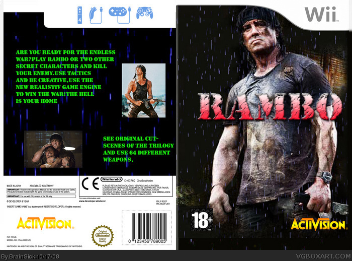
I would post the front on the right side so people can see it in the preview image. You have A good thing going on the front, but the back is a different story. Far too much text, and the red text isn't working for me, and please don't use shrink wrap like that on that screenshot.
#5, The back seems...lacking somehow. I would take a look at war game boxes, like Call of Duty and Medal of Honor to get a better feel for the back layout. I am glad you switched the front to the right.
 Rambo Box Cover Comments
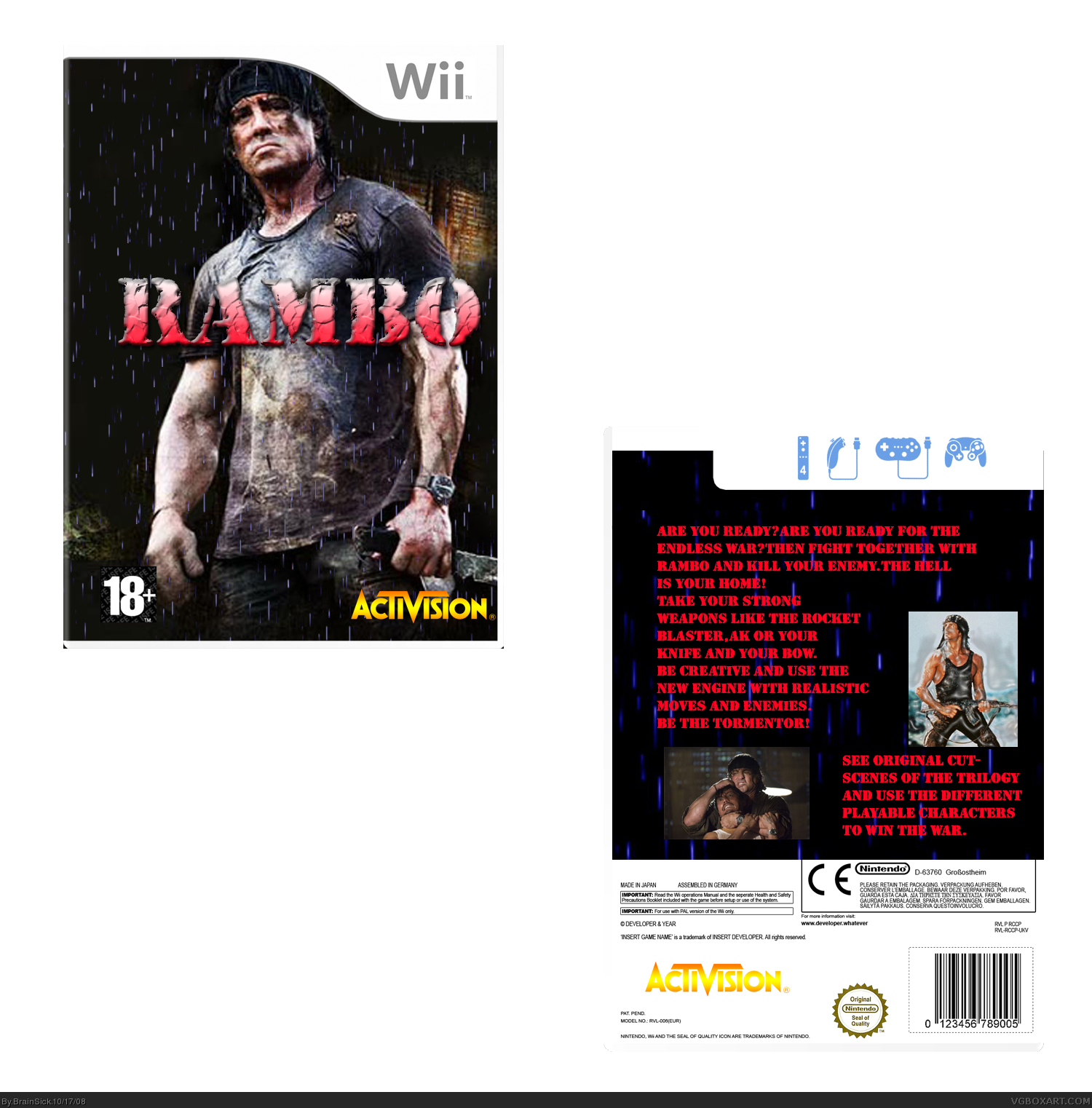
You must see it in full size to read the text at the back...
[ Reply ]
Okay i updated it... Now you can read the text without full size
[ Reply ]
great idea, but poorly made. but keep at it and you'll get better! :)
[ Reply ]
I would post the front on the right side so people can see it in the preview image. You have A good thing going on the front, but the back is a different story. Far too much text, and the red text isn't working for me, and please don't use shrink wrap like that on that screenshot.
Decent concept, needs work.
[ Reply ]
Okay i made it on the right...
EDIT: I made one with green,purple,blue,red and yellow text...
Is green good?
Edited at 1 decade ago
[ Reply ]
#5, The back seems...lacking somehow. I would take a look at war game boxes, like Call of Duty and Medal of Honor to get a better feel for the back layout. I am glad you switched the front to the right.
[ Reply ]