It's kind of boring in all aspects, but everything is decent on a technical stand point. Take a look at the elements that make a good box, and try to work them into your own designs. Also, the layout is backwards. Typically the front of the box should be on the right, and the back to the left.
Front is boring but evrything looks porportional. Back, text needs to either be smaller or have a better look to it. Other than that i like it, it a prety good first. 3/5
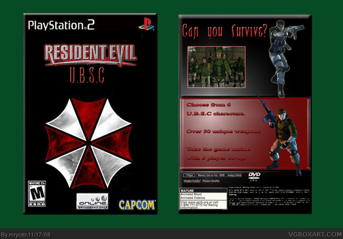
 Resident Evil U.B.S.C Box Cover Comments
This is my first time doing this so give me some tips and stuff
like I said this is my very very first box
[ Reply ]
It's kind of boring in all aspects, but everything is decent on a technical stand point. Take a look at the elements that make a good box, and try to work them into your own designs. Also, the layout is backwards. Typically the front of the box should be on the right, and the back to the left.
Edited at 1 decade ago
[ Reply ]
Front is boring but evrything looks porportional. Back, text needs to either be smaller or have a better look to it. Other than that i like it, it a prety good first. 3/5
[ Reply ]
thanks guys for saying it does not suck lol
anyway I will try to include some cooler looking things in my next box and will work harder on my fronts
[ Reply ]