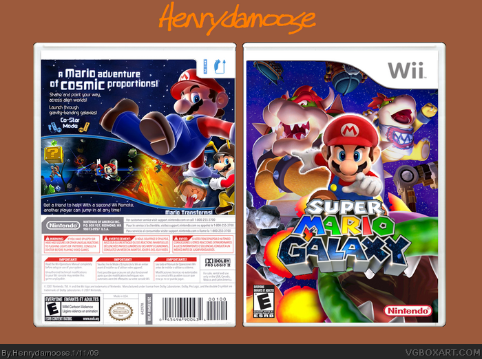
Ok, I don't care if someone says "OMG THIS SUXXORZ, MINE ROXXORZ LOLOLOL". I did the custom Mario render MYSELF. The whole thing took about 3 hours. The background is from the Super Mario Wiki. I almost started ripping out my own hair out, it was so hard. I need something other than paint. But, enjoy if you can.
It doesn't suck. The composition is actually pretty cool. Sure, there are some technical errors like the esrb/ninty logos overlapping the logo and a choppy mario render. But if you fix those and work on your presentation some more, this would turn out even better. ;)
This really is a great effort, especially for paint. It's obvious you have a strong interest in graphic arts, so I would seriously recommend downloading Gimp or Paint.net.
If you can do this with paint, I'd love to see what you can do once you get the hang of one of those programs.
Added back now. Temp is KoopaDasher's. It was hard to find the right renders for the Mario pic. and the text. Here is the finished project! ENJOY!!! MERRY CHRISTMAS!
Ok, is there anything I need to do? After I always updated a box, I don't get comments until 6 weeks later. BTW, I have no ideas for the spine. I'll probaby add that...maybe.....later on.
EDIT: #20, I take that as how bad you think it is?
Is this really made in Paint? It's a PNG file?
Anyways, that back roks, seriously! I think you have to remove some characters on the front, because it looks way too zoomed in. =P
EDIT: Oh, nevermind, I thought you couldn't save as PNG with Paint, my bad! =p
Again, really great for something done in paint. I am truly impressed.
once you get a handle on GIMP, I'm certain we'll be seeing a lot of great designs from you.
Wow, I think it's really nice! There's some things that I don't like, though.
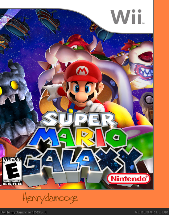
1) It's great how you used a different Mario render! But I wish you could see more of his body. I think you should move the Mario Galaxy logo down and make it smaller as well.
2) Mario kinda camouflages with the back, yet he's supposed to be the main focal point. I wish you could add some kinda shadow or maybe a nice white outerglow around him!
3) The back is nice. But the placement of the features are odd, and there's only 2 of them. I suggest adding one more and putting them under the 'A Mario adventure of Cosmic Proportions' text.
Pretty sweet!! If you work with it a little more, I'll fav ! :D
Added glow! Took about 2 hours to get this right although Maximum linked me the plug-in like 2 hours ago. I added more text on the back and made Bowser and Bowser Jr. more visible. Enjoy! Comment and rate please.
OMG! Subliminal message! Erase all the letters in mario galaxy logo except the ones with a star on the corner. what it reads? UR MR GAY! 5/5 awesome box. fav.
 Super Mario Galaxy Box Cover Comments
Ok, I don't care if someone says "OMG THIS SUXXORZ, MINE ROXXORZ LOLOLOL". I did the custom Mario render MYSELF. The whole thing took about 3 hours. The background is from the Super Mario Wiki. I almost started ripping out my own hair out, it was so hard. I need something other than paint. But, enjoy if you can.
[ Reply ]
That Mario render is really choppy!
[ Reply ]
It doesn't suck. The composition is actually pretty cool. Sure, there are some technical errors like the esrb/ninty logos overlapping the logo and a choppy mario render. But if you fix those and work on your presentation some more, this would turn out even better. ;)
[ Reply ]
It was pretty clever to use that render of Mario. Do what LK said and you could have a pretty good box.
[ Reply ]
i like it =) you rendered that mario in paint? :o
i agree with TTT and LK
[ Reply ]
Nice but you should really get gimp or paint.net their both free and a hell of a lot better than paint. Though you did well to do this in paint.
[ Reply ]
#3,#4,#5,#6 Wow! Thanks! :D
[ Reply ]
V2 is up! I changed template (KoopaDasher's) and I did as much as I could to the Mario render. Now I feel happy about this. :D
[ Reply ]
Sorry for bump but, *waits patiently for users to comment*
[ Reply ]
baby bowser is hidden...
+fav
Edited at 1 decade ago
[ Reply ]
Sorry for bump agin, but I really worked hard on this. 172 views only? Come on. Critique.
EDIT: I'm sorry, Reed.
Edited at 1 decade ago
[ Reply ]
No bumping
[ Reply ]
Holy shit! Paint. You have some skills.
[ Reply ]
Looks much better!
I would increase the size of the esrb and ninty logos just a tad bit more though. Keep up the good work. :)
[ Reply ]
#14, Thanks. :D I'm gonna work on that now.
[ Reply ]
This really is a great effort, especially for paint. It's obvious you have a strong interest in graphic arts, so I would seriously recommend downloading Gimp or Paint.net.
If you can do this with paint, I'd love to see what you can do once you get the hang of one of those programs.
[ Reply ]
Updated! I fixed the ninty/esrb logos.
#16, Thanks! I actually downloaded GIMP yesterday but I never had time to learn how to use it. I'll be trying! :D
[ Reply ]
Added back now. Temp is KoopaDasher's. It was hard to find the right renders for the Mario pic. and the text. Here is the finished project! ENJOY!!! MERRY CHRISTMAS!
[ Reply ]
Ok, is there anything I need to do? After I always updated a box, I don't get comments until 6 weeks later. BTW, I have no ideas for the spine. I'll probaby add that...maybe.....later on.
EDIT: #20, I take that as how bad you think it is?
Edited at 1 decade ago
[ Reply ]
#19, it isnt normal for your box to get commented each day.
[ Reply ]
Wow, this is really good for paint! Good job Henry, but try not to make 9 out of 21 of your comments by you ;)
[ Reply ]
Is this really made in Paint? It's a PNG file?
Anyways, that back roks, seriously! I think you have to remove some characters on the front, because it looks way too zoomed in. =P
EDIT: Oh, nevermind, I thought you couldn't save as PNG with Paint, my bad! =p
Edited at 1 decade ago
[ Reply ]
wow, this is good! +fav.
[ Reply ]
Again, really great for something done in paint. I am truly impressed.
once you get a handle on GIMP, I'm certain we'll be seeing a lot of great designs from you.
[ Reply ]
I like this and I can't believe your quiting It get's a favorite from me. :)
[ Reply ]
Wow, I think it's really nice! There's some things that I don't like, though.
1) It's great how you used a different Mario render! But I wish you could see more of his body. I think you should move the Mario Galaxy logo down and make it smaller as well.
2) Mario kinda camouflages with the back, yet he's supposed to be the main focal point. I wish you could add some kinda shadow or maybe a nice white outerglow around him!
3) The back is nice. But the placement of the features are odd, and there's only 2 of them. I suggest adding one more and putting them under the 'A Mario adventure of Cosmic Proportions' text.
Pretty sweet!! If you work with it a little more, I'll fav ! :D
[ Reply ]
Added glow! Took about 2 hours to get this right although Maximum linked me the plug-in like 2 hours ago. I added more text on the back and made Bowser and Bowser Jr. more visible. Enjoy! Comment and rate please.
[ Reply ]
OMG! Subliminal message! Erase all the letters in mario galaxy logo except the ones with a star on the corner. what it reads? UR MR GAY! 5/5 awesome box. fav.
[ Reply ]
#28, it's true!
[ Reply ]
#1, Yes, get Paint.NET or GIMP, they are free.
Ditto on what Ladykiller said.
[ Reply ]
#28, You are 2 years late.
[ Reply ]
Thanks for the favs! :D
[ Reply ]
This is quite good. I like it.
[ Reply ]