It's not too bad, but its all choppy and yes the helmet is gone, you need to go to Planet Renders to get rendered picture and if not good at rendering just ask me or people at the forum for help. Your improving alot and I'm glad to see that but remember, never EVER blow up a big when its small, try to find decent size then make it a little bigger. Hope this helped 2.8/5
I think Squall has said everything that needs to be said. The design, and layout is great the renders are just very blurry and choppy. I'd like to see you work on this a bit more, and perhaps give an update. If you need any help or criticism, post it in the forums, or send me a PM. :D
anyways, i don't like the front at all really, but the back's pretty good. except for the text and the template. the template is very choppy and the text is too short and the wording of it doesn't make sense. lol. :)
I see the improvement in this. I still think the text on the back and the entire Logo could use a either bigger outer glow, or thicker stroke. Not bad, but I think someone said before stretching logos up isn't a good idea. It'd have been okay if the box had gone down on size in an update.
 Hero of Sparta Box Cover Comments
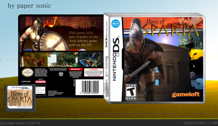
My new box and my fav game on my ipod touch and I throught I would be a awesome box on ds cred too who ever made the template and merry christmas
[ Reply ]
Um its ok, but the guy's helmet has a huge missing piece in it...and the spartan is choppy.
[ Reply ]
It's not too bad, but its all choppy and yes the helmet is gone, you need to go to Planet Renders to get rendered picture and if not good at rendering just ask me or people at the forum for help. Your improving alot and I'm glad to see that but remember, never EVER blow up a big when its small, try to find decent size then make it a little bigger. Hope this helped 2.8/5
[ Reply ]
#3, Thank you
[ Reply ]
thanks Rex
[ Reply ]
I think Squall has said everything that needs to be said. The design, and layout is great the renders are just very blurry and choppy. I'd like to see you work on this a bit more, and perhaps give an update. If you need any help or criticism, post it in the forums, or send me a PM. :D
[ Reply ]
yeah the hole in the guys head ruines it
can I pm you It when i have done the update
[ Reply ]
thanks flash
[ Reply ]
thanks flash
[ Reply ]
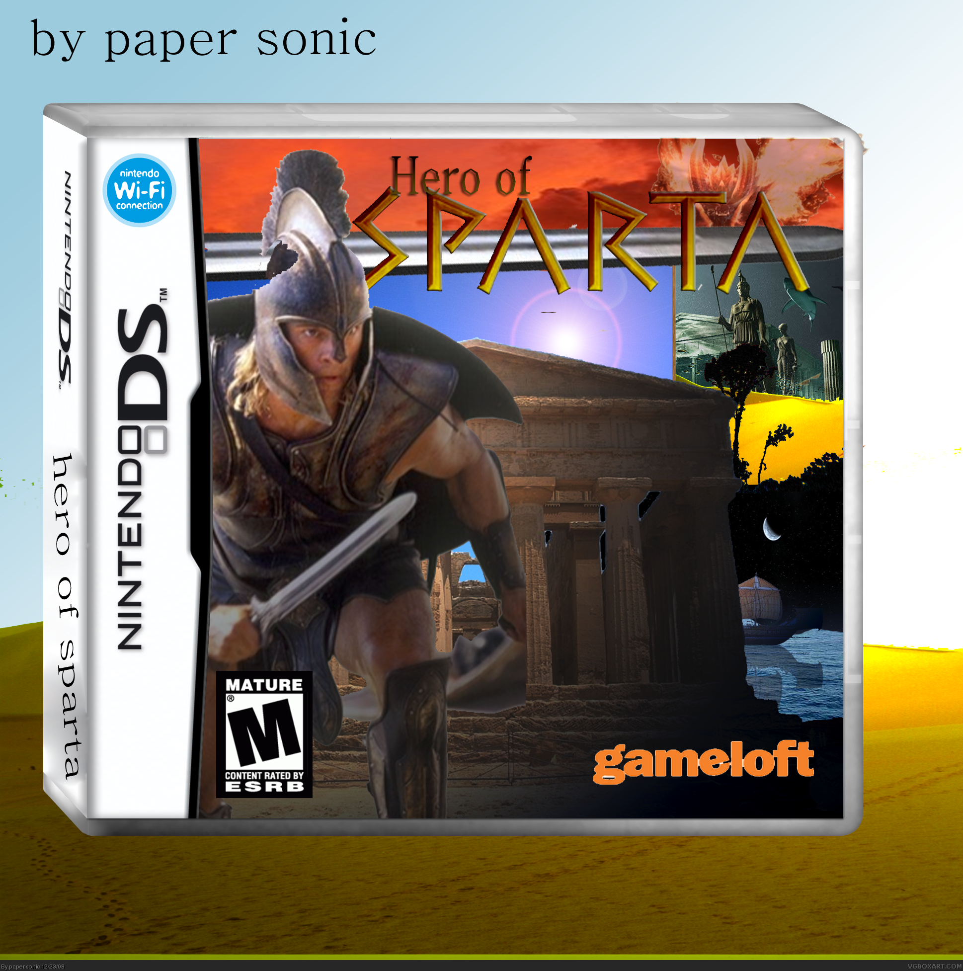
updated it hope you like it now
[ Reply ]
Brad Pitt?....
anyways, i don't like the front at all really, but the back's pretty good. except for the text and the template. the template is very choppy and the text is too short and the wording of it doesn't make sense. lol. :)
[ Reply ]
#11, yeah thanks the template is choopy because it huge lol glad you like the back i like it too lol I suck at wrighting any tips for the front
Brad Pitt.. lol
[ Reply ]
well that is brad pitt right? from the movie Troy? lol.
[ Reply ]
#13, Right lol I did not know that
[ Reply ]
I see the improvement in this. I still think the text on the back and the entire Logo could use a either bigger outer glow, or thicker stroke. Not bad, but I think someone said before stretching logos up isn't a good idea. It'd have been okay if the box had gone down on size in an update.
[ Reply ]
#15 thanks I will try too make it smaller lol
[ Reply ]
Much better now.
[ Reply ]
thanks
[ Reply ]
It's a good box,But dude,Half these comments are yours.
[ Reply ]
yes I do comment a lot that will be my new year revolution lol
Edited at 1 decade ago
[ Reply ]