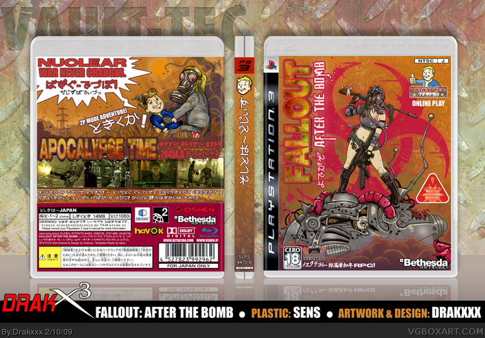
I was talking with a friend of mine recently about how Japanese developers have been hiring third parties to come in to do sequels and spins offs of their popular series. (Street Fighter, Silent Hill, House of The Dead, etc.) I thought it would be amusing if the situation was reversed, and an American developer hired a Japanese company to do a spin off of one of their franchises.
Thus I came up with "Fallout: After the Bomb", a spin off of the popular post apocalyptic RPG, for this box design.
As per usual with these custom game idea designs, the renders are custom drawings. I also did a lot of texture work on this one with the logos and what not.
This design also exists as my entry against tleeart in Round 1 of Rasegan Boy's "Teh Art Comp".
This looks awesome, but there are a few things that bring it down imo.
-All the logos and stuff on the front. Get rid of some of them. You made an awesome cover. Why cram it full of logos?
-The "Fallout" text on the front, and the "Apocalypse Time" text on the back. It just stands out too much and looks a little odd. You used a nice texture, but I think the stroke that you put around each looks out of place.
- The spine. It lacks all around.
Yeah, apart from those few minor faults the cover is awesome.
#31 Thanks man! I kept alternating between more stand out texts, and ones that were more subtle, and I eventually thought the stand out effects looked a little better. I can totally understand what your saying though.
In regards to the abundance of logos, and the rather plain spine, I agree on a visual standpoint, but I designed the box as one that would be commonly seen on the Japanese market, and these aesthetics are very common from what I've seen.
#6, Wasa-bi has stated before that a lot of his Japanese text is just gibberish. I doubt he'd mind some inaccuracies.
Drakx, I really admire your creativity and work. I'm sure I've told you this before, but you do what I've been wanting to do here, except I never find the drive and motivation. I've got dozens of ideas for hypothetical games and various box ideas jotted down in notebooks that have just never come into fruition, so I'm certainly proud of you for really standing out and going the extra mile instead of just copy/paste/filtering your way to the HoF.
That said, I really have mixed feelings about your drawings. Sometimes they look really refined, almost professional, as is the case with the cover to this. Other times they look really amaturish and rushed.
I have the most fun creating boxes for my own ideas as well. It's always interesting to see how something will come together for an idea you have, and a box design is a very tangible piece of the process I believe. I appreciate your support, and certainly recognize you as a kindred artist of the sorts, for your similar forays into this kind of stuff. :)
In regards to the various drawings, it could be a number of things that are catching your eye wrong with some of them. I do try to work within different styles and invoke different modes with colors, art effects etc, sometimes with mixed final results. Also, since I've done most of the art you see on the boxes here digitally with the pen tablet, I find that a really strong sketch done traditionally with paper and pencil, can turn into something completely different once you get photoshop involved.
Even though I've been doing artwork for a good portion of my life so far, I'm still learning a lot within both traditional and digital mediums myself.
Excellent stuff mate.... great mix of game styles there. Love it. :) And the Japanese text looks good! :D (I usually rip it straight from the Japanese site or even Amazon.co.jp :))
OH.. I've made a start of my drawn boxart.. although I'm not too use to the Wacom tablet/pen, more tricky than I thought... guess I'm too use to using the mouse too much over the years! LOL --- I'll post a preview at discoloury on your Fallout thread :)
So sorry I missed this when it hit the site. (I've been away for a bit.) This may be my favorite from you to date. Simply amazing artwork and wonderful execution! FAV+++
 Fallout: After The Bomb Box Cover Comments
I was talking with a friend of mine recently about how Japanese developers have been hiring third parties to come in to do sequels and spins offs of their popular series. (Street Fighter, Silent Hill, House of The Dead, etc.) I thought it would be amusing if the situation was reversed, and an American developer hired a Japanese company to do a spin off of one of their franchises.
Thus I came up with "Fallout: After the Bomb", a spin off of the popular post apocalyptic RPG, for this box design.
As per usual with these custom game idea designs, the renders are custom drawings. I also did a lot of texture work on this one with the logos and what not.
This design also exists as my entry against tleeart in Round 1 of Rasegan Boy's "Teh Art Comp".
Thanks as always guys.
[ Reply ]
absolutely stunning
[ Reply ]
Wow.
[ Reply ]
The art looks excellent.
[ Reply ]
Amazing; the detailing is great.
[ Reply ]
I hope you got your Japanese right, otherwise wasa-bi is gonna come in and roundhouse your ass.
[ Reply ]
*Breaks fave button but continues to press it anyway*
[ Reply ]
#7, Its a link xD Awsome box dude!love your illustrations.
[ Reply ]
Amazing art as always Draxxx :D
[ Reply ]
That picture on the back just made me to fav this :D
[ Reply ]
<3
[ Reply ]
WOW
[ Reply ]
Amazing! As usual!
[ Reply ]
Wow...my jaw literally dropped when I say this, that back picture is bloody amazing.
PS: Just out of curiosity...what sort of tablet do you use for your artwork? Is it one of those expensive Wacom ones, or...?
Edited at 1 decade ago
[ Reply ]
Awesome, just because you drew it :D
[ Reply ]
Ooh! I like the shonen Jump manga feel of it!
[ Reply ]
Thanks guys :)
#6 if we were to translate the Japanese texts I mocked up back to English... it would probably summon the devil lol.
[ Reply ]
... mummy... that's awesome! Well done dude!
[ Reply ]
Beautiful sketches as usual.
I especially like the colour scheme on this one.
Great job!
[ Reply ]
Drugs for my eyes!
[ Reply ]
Kinda reminds me of what you christians call Jesus.
[ Reply ]
#21, ....what? lol
[ Reply ]
Im blown away, this box is pure win
[ Reply ]
This is one box that actually DOES deserve HoF.
I can't spot any problems, it looks completely clean and flawless.
[ Reply ]
This is amazing on at least 50 different levels. Even though you're a shoe in for the win, may the best man win!
Just wow.
[ Reply ]
Dude!! Awesome work as usual! The detail in the cover is amazing. ++FAV
[ Reply ]
#6, Wasa-bi even admitted he just uses a dummy text, haha
But yeah, pretty sweet, it actually looks like what the Japanese would do with it
[ Reply ]
... Tleart is in for a fight, posted soon, because I lost com privlages for now...
[ Reply ]
Congratulations on becoming a very well deserved rank 9! I don't really like the style but it is a very well done box.
[ Reply ]
Awesome, 'grats on Rank 9!
[ Reply ]
This looks awesome, but there are a few things that bring it down imo.
-All the logos and stuff on the front. Get rid of some of them. You made an awesome cover. Why cram it full of logos?
-The "Fallout" text on the front, and the "Apocalypse Time" text on the back. It just stands out too much and looks a little odd. You used a nice texture, but I think the stroke that you put around each looks out of place.
- The spine. It lacks all around.
Yeah, apart from those few minor faults the cover is awesome.
[ Reply ]
Thanks again guys!
#31 Thanks man! I kept alternating between more stand out texts, and ones that were more subtle, and I eventually thought the stand out effects looked a little better. I can totally understand what your saying though.
In regards to the abundance of logos, and the rather plain spine, I agree on a visual standpoint, but I designed the box as one that would be commonly seen on the Japanese market, and these aesthetics are very common from what I've seen.
Edited at 1 decade ago
[ Reply ]
Man,there are no words who can explain how kick ass this O_o
*bows in respect*
[ Reply ]
nice! spine lacks a bit but nice.
[ Reply ]
#6, Wasa-bi has stated before that a lot of his Japanese text is just gibberish. I doubt he'd mind some inaccuracies.
Drakx, I really admire your creativity and work. I'm sure I've told you this before, but you do what I've been wanting to do here, except I never find the drive and motivation. I've got dozens of ideas for hypothetical games and various box ideas jotted down in notebooks that have just never come into fruition, so I'm certainly proud of you for really standing out and going the extra mile instead of just copy/paste/filtering your way to the HoF.
That said, I really have mixed feelings about your drawings. Sometimes they look really refined, almost professional, as is the case with the cover to this. Other times they look really amaturish and rushed.
What's the deal?
[ Reply ]
Thanks Slyder,
I have the most fun creating boxes for my own ideas as well. It's always interesting to see how something will come together for an idea you have, and a box design is a very tangible piece of the process I believe. I appreciate your support, and certainly recognize you as a kindred artist of the sorts, for your similar forays into this kind of stuff. :)
In regards to the various drawings, it could be a number of things that are catching your eye wrong with some of them. I do try to work within different styles and invoke different modes with colors, art effects etc, sometimes with mixed final results. Also, since I've done most of the art you see on the boxes here digitally with the pen tablet, I find that a really strong sketch done traditionally with paper and pencil, can turn into something completely different once you get photoshop involved.
Even though I've been doing artwork for a good portion of my life so far, I'm still learning a lot within both traditional and digital mediums myself.
[ Reply ]
Excellent stuff mate.... great mix of game styles there. Love it. :) And the Japanese text looks good! :D (I usually rip it straight from the Japanese site or even Amazon.co.jp :))
OH.. I've made a start of my drawn boxart.. although I'm not too use to the Wacom tablet/pen, more tricky than I thought... guess I'm too use to using the mouse too much over the years! LOL --- I'll post a preview at discoloury on your Fallout thread :)
[ Reply ]
ur artwork on boxes is absolutely incredible. +fav
[ Reply ]
Love the box, and love the concept.
Somehow, I think that this would look even better as a DS box...has a light-hearted DS nature to it
+FAV
[ Reply ]
So sorry I missed this when it hit the site. (I've been away for a bit.) This may be my favorite from you to date. Simply amazing artwork and wonderful execution! FAV+++
[ Reply ]