niceeeee! but i felt the logo could of blended in with the background.. instead of looking like a bog standard logo! fav! There are little things like the template, capcom logo and other little bits that need changing!
#5 about the logo, I wanted to use the official y'know, so it retains the Re fell, and the temp, I added the back of an official PS1 temp onto StevenChos temp to give it a more nostalgic feel, but tell me whats wrong with the Capcom and Ill get round to changing is ASAP. Thanks all the same
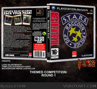
 Playstation Network: Resident Evil Box Cover Comments
My entry into the themed competition against xXx aGeAn xXx, credits are on the box under the back, so enjoy, and tell me what you think!
#3 it says xXx aGeAn xXx in the match-up thread though..., thanks for the fave none-the-less
#2 thanks!
Edited at 1 decade ago
[ Reply ]
Love it, dude :)
[ Reply ]
#1, Your against stevencho
[ Reply ]
Wow, nice, Resident Evil. <3
[ Reply ]
niceeeee! but i felt the logo could of blended in with the background.. instead of looking like a bog standard logo! fav! There are little things like the template, capcom logo and other little bits that need changing!
Edited at 1 decade ago
[ Reply ]
Nice design man. Your minimalistic style worked great with this one.
[ Reply ]
Really great. Very minimal, but done so well.
5/5, fav'd
[ Reply ]
thanks guys
#5 about the logo, I wanted to use the official y'know, so it retains the Re fell, and the temp, I added the back of an official PS1 temp onto StevenChos temp to give it a more nostalgic feel, but tell me whats wrong with the Capcom and Ill get round to changing is ASAP. Thanks all the same
[ Reply ]
AWESOME! and i love that logo! So authentic looking. +fav!
[ Reply ]