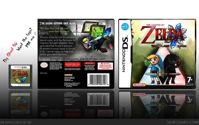
Sorry for having another DS-box... :p
I worked pretty hard on this .
Credit to Nick-s-nut for the back text. (since I don't really know Zelda's story )
Made the logo myself, added some color to the triforce on the front (which was pretty hard work)
If you have trouble reading it, try to enlarge it or zoom the box. I'm on the search for a bigger temp now.
Please let me know what you think of this :)
I love that logo, just place the 'legend of' bit just above Zelda, and change the Snowflake Rupee font. Definatly your best, just fix the logo and you have earned a favourite from me =)
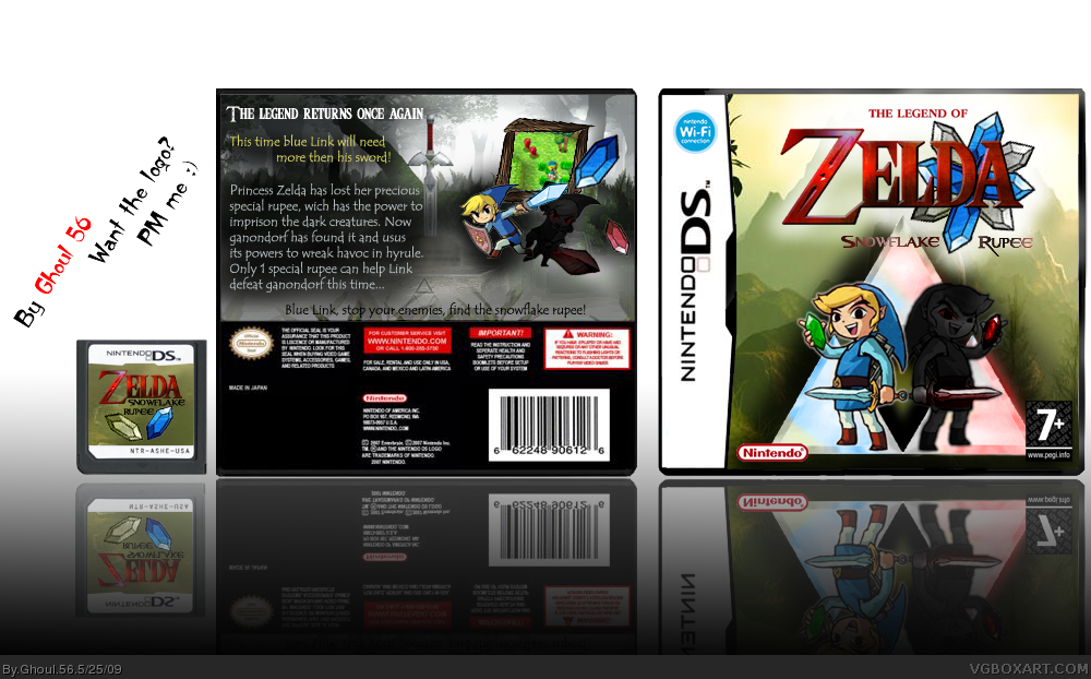
Update: Added 1 screen, rupees now contain a reflection of Link and Zelda and the logo was updated.
The white in the added screenshot is supposed to be mist :)
isnt Rupee the currency of India? anyway, looks pretty good! I just dont like how there are two Links on the front, and one of them being really dark, and that 'Snowflake Rupee' is in the Resident evil font. Its good, but my main let down is the really dark Link
The dark Link would have a roll in the game too. He's more likely Link's shadow in this game. "Created" by Ganondorf. The res evil font is in my eyes good looking on this box! The Triforce font isn't my favorite and I try to not too use it much. Read the story, there's something magical going on with that "currency".
 Zelda: Snowflake Rupee Box Cover Comments
Sorry for having another DS-box... :p
I worked pretty hard on this .
Credit to Nick-s-nut for the back text. (since I don't really know Zelda's story )
Made the logo myself, added some color to the triforce on the front (which was pretty hard work)
If you have trouble reading it, try to enlarge it or zoom the box. I'm on the search for a bigger temp now.
Please let me know what you think of this :)
[ Reply ]
Eh, not bad :) You could use more screenshots, but it is really good lookin!
Edited at 1 decade ago
[ Reply ]
Nice.
[ Reply ]
Thank you guys :)
[ Reply ]
This is wicked!
[ Reply ]
Thanks for the favs and good comments but I think my next'll be XBox360 or something cause noone other then you guys seems to even look at this... :(
[ Reply ]
I love that logo, just place the 'legend of' bit just above Zelda, and change the Snowflake Rupee font. Definatly your best, just fix the logo and you have earned a favourite from me =)
[ Reply ]
My mouth hangs wide open as a tear rolls down my face.
[ Reply ]
Thanks again :) I will update the logo, thanks for the tip :p
[ Reply ]
... what else is there to say? i love it! :)
[ Reply ]
Update: Added 1 screen, rupees now contain a reflection of Link and Zelda and the logo was updated.
The white in the added screenshot is supposed to be mist :)
[ Reply ]
isnt Rupee the currency of India? anyway, looks pretty good! I just dont like how there are two Links on the front, and one of them being really dark, and that 'Snowflake Rupee' is in the Resident evil font. Its good, but my main let down is the really dark Link
[ Reply ]
The dark Link would have a roll in the game too. He's more likely Link's shadow in this game. "Created" by Ganondorf. The res evil font is in my eyes good looking on this box! The Triforce font isn't my favorite and I try to not too use it much. Read the story, there's something magical going on with that "currency".
I forgot the reflection in the previous btw :)
Edited at 1 decade ago
[ Reply ]
all that I truly, 100% dislike is the plain text on the back of the box. otherwise, okay job!
+fav.
[ Reply ]
Great jov i would have to fav it
[ Reply ]
right now i'm working on my first box does anyone have some tips for me?
[ Reply ]
#16 - Go to the forums, and have a look in the Help/Tips/Tutorials section.
[ Reply ]