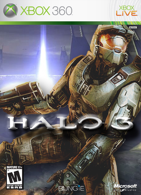
It's good, but not great. If you can fix up all the little things wrong with it, you'll have an awesome box art. Try getting a better Halo 3 logo and also (if you are adept enough at Photoshop) fix up the lighting on Master Chief so it matches the background better. Also, try not to have part of his helmet being cut off by the template.
#6, I know what your saying; it does get tiresome seeing the same handful of pics of MC, but the options are just not that high, right now. And seeing that there are so, so many boxes for Halo 3, it just raises up the scale even higher to see who does the most high quality job...
Nice, definite improvement over the old version. The only thing I'd say is that the Bungie logo looks off in the middle on MC's hand. Might look better right next to the MS logo instead.
And #18, those are blend properties/filters in photoshop.

 Halo 3 Box Cover Comments
10/10 this is one of the most awesome boxarts for Halo 3 i have ever seen
[ Reply ]
i iike the boxart but i dont like the title. 9.5/10
[ Reply ]
could be better.
i dont like the logo on this one and the picture is from the graphic novel so it doesn't really fit the background.
nevertheless, 4/5
[ Reply ]
It's good, but not great. If you can fix up all the little things wrong with it, you'll have an awesome box art. Try getting a better Halo 3 logo and also (if you are adept enough at Photoshop) fix up the lighting on Master Chief so it matches the background better. Also, try not to have part of his helmet being cut off by the template.
[ Reply ]
I'll try out what you suggested, but I had no choice with his helmet being cut-off, there was text overlapping it.
[ Reply ]
Finally a halo 3 boxart that doesn't comprise of a cheesy edit of the E3 trailer. I award your non comformistism.
[ Reply ]
Dude, the trailer is the only real footage of Master Chief in Halo 3. It's not conforming, it's making do with what we have.
[ Reply ]
#7,
[ Reply ]
*ditto
[ Reply ]
#6, I know what your saying; it does get tiresome seeing the same handful of pics of MC, but the options are just not that high, right now. And seeing that there are so, so many boxes for Halo 3, it just raises up the scale even higher to see who does the most high quality job...
... I like the challenge. :)
The challenge of being challenged is challenging.
[ Reply ]
#10 "to see who does the most high quality job..."
ya know its me ;)
[ Reply ]
#11, I was actually referring to MAV_WOLF.
[ Reply ]
How's this logo?
[ Reply ]
#13, The 3 is a little hard to read, but you have to be an idget not to know it's a 3.
[ Reply ]
How's this?
[ Reply ]
helghastmist, how did u do that to the halo 3 text? i have the regular halo 3 text, but im new to photoshop, wat exactly did u do?
[ Reply ]
Did what to it?
[ Reply ]
on the previous versions, the text has a gradient and a glow, i have no clue how to do that
[ Reply ]
Nice, definite improvement over the old version. The only thing I'd say is that the Bungie logo looks off in the middle on MC's hand. Might look better right next to the MS logo instead.
And #18, those are blend properties/filters in photoshop.
[ Reply ]
Wow, that's sweet... did you steal that from Bungie or something? ;)
5/5!
[ Reply ]
5/5 nice work man
[ Reply ]