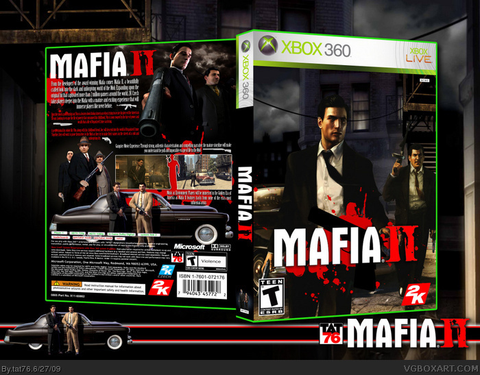
I'm not sure if you put those people on the front, but the background looks a little too over-contrasted and doesn't blend with them. The rest is great.
I'm not a fan of having the game's name as the tagline. The synopsis is also unreadable and the render of those 3 people is down in graphics because it's from mafia 1 and doesn't work with the rest of the box. I like the divider of the screenshots but it's a little blurry. The blood splatters should also be darker.
The front looks very good but the characters don't blend too well with the background as they are too bright. Also try putting some blood splats on their shirts, it is the mafia. Again the blood splats are too bright. The esrb is squashed. I'm also not a fan of the template nor the spine.
Overall a great box but needs improvements.
Oh yes and Mafia 2 will rock your world ;)
#7, Go and get grandma's glasses... :)
and start reading...
Born the son of a poor immigrant, Vito is a beaten down Italian American who is trying to secure his piece of the American Dream. Looking to escape the life of poverty that consumed his childhood, Vito is soon swayed by the lure of power and wealth that a life of Organized Crime can bring.
A petty criminal his whole life, Vito, along with his childhood friend, Joe, will descend into the world of Organized Crime. Together, they will work to prove themselves to the Mob as they try to make their names on the streets of a cold and unforgiving city.
#8, The description needs to be readable, I can't read it either. Your last 6 boxes have been rather small, I can't read the description on any of them because the boxes are too small in full view.
#8, Your not funny you know. I could make out the white text but not much and the red text isn't readable. You need on the box. I mean for crying out loud, this box is great but you need to learn to accept criticism. We don't want another jevan (in that respect)
 Mafia II Box Cover Comments
If you don't Fav it, I'll whack you.... :)
[ Reply ]
I'm not sure if you put those people on the front, but the background looks a little too over-contrasted and doesn't blend with them. The rest is great.
[ Reply ]
I'm not a fan of having the game's name as the tagline. The synopsis is also unreadable and the render of those 3 people is down in graphics because it's from mafia 1 and doesn't work with the rest of the box. I like the divider of the screenshots but it's a little blurry. The blood splatters should also be darker.
The front looks very good but the characters don't blend too well with the background as they are too bright. Also try putting some blood splats on their shirts, it is the mafia. Again the blood splats are too bright. The esrb is squashed. I'm also not a fan of the template nor the spine.
Overall a great box but needs improvements.
Oh yes and Mafia 2 will rock your world ;)
[ Reply ]
#3, Yeah I whack you....
[ Reply ]
You do it again, man...
*Sound of clicks over the Fav button*
[ Reply ]
Nice job dude, gonna have to hold back a fav though D=
The front doesn't blend well as TTT said.
The back is great though dude b(^_^)d
[ Reply ]
Even if you refuse to listen to criticism the synopsis is unreadable.
[ Reply ]
#7, Go and get grandma's glasses... :)
and start reading...
Born the son of a poor immigrant, Vito is a beaten down Italian American who is trying to secure his piece of the American Dream. Looking to escape the life of poverty that consumed his childhood, Vito is soon swayed by the lure of power and wealth that a life of Organized Crime can bring.
A petty criminal his whole life, Vito, along with his childhood friend, Joe, will descend into the world of Organized Crime. Together, they will work to prove themselves to the Mob as they try to make their names on the streets of a cold and unforgiving city.
Happy now not too Coolguy?
link
Edited at 1 decade ago
[ Reply ]
#8, The description needs to be readable, I can't read it either. Your last 6 boxes have been rather small, I can't read the description on any of them because the boxes are too small in full view.
[ Reply ]
#9, Just added printable. You can read it there...
[ Reply ]
#8, Your not funny you know. I could make out the white text but not much and the red text isn't readable. You need on the box. I mean for crying out loud, this box is great but you need to learn to accept criticism. We don't want another jevan (in that respect)
Edited at 1 decade ago
[ Reply ]