before you say this is cluttered, let me explain, GhamZ had alot of requirements for this, and my hi - res version wouldnt upload, so i had to make it smaller, i tried a similar approach like my BIS box, because, club nintendo exclusives are shiny, but i didnt want to use gold this time, and silver looked pretty nice.
credit:
ninty: ds template
grahamz: book template
jevangod: cd & dvd template
c&c as always, enjoy!
Oh, and I love the tagline for some reason.
Only one thing, I don't think that there would be that much artwork. That book is as long as the last Harry Potter book. You need to put it on a magazine or something.
& I just noticed that on the front of the game Mario's foot is on top of the template.
#3, a) thats the only tmplate i have
b) hes supposed to look like he's "popping out" of the box
#5 thanks
also, just so you guys know, im gonna be done with making boxarts for a while after im finished my next project.
I hate to be the jerk on almost every persons box. I just don't get what's so spectacular. Everything is just renders on white with black lines and rising sun spirals. I think everyone's just overwhelmed with everything put together.
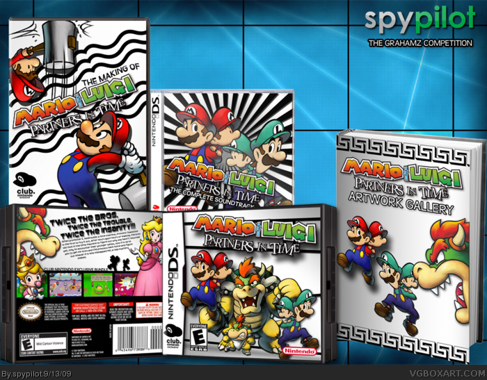
 Mario & Luigi: Partners In Time Box Cover Comments
before you say this is cluttered, let me explain, GhamZ had alot of requirements for this, and my hi - res version wouldnt upload, so i had to make it smaller, i tried a similar approach like my BIS box, because, club nintendo exclusives are shiny, but i didnt want to use gold this time, and silver looked pretty nice.
credit:
ninty: ds template
grahamz: book template
jevangod: cd & dvd template
c&c as always, enjoy!
[ Reply ]
Hmm... Very interesting....
I like it!
I'll fav ;)
[ Reply ]
I like it.
Oh, and I love the tagline for some reason.
Only one thing, I don't think that there would be that much artwork. That book is as long as the last Harry Potter book. You need to put it on a magazine or something.
& I just noticed that on the front of the game Mario's foot is on top of the template.
[ Reply ]
#3, a) thats the only tmplate i have
b) hes supposed to look like he's "popping out" of the box
#5 thanks
also, just so you guys know, im gonna be done with making boxarts for a while after im finished my next project.
Edited at 1 decade ago
[ Reply ]
Another awesome job spypilot!
[ Reply ]
This one is much better than the last.
[ Reply ]
#6, thanks :3
i kinda like it better too.
[ Reply ]
I don't think you're supposed to have this up yet...
And personally i think everything is too plain
[ Reply ]
#8, ghrahamZ never said anything about not posting it yet so...
also plain was the look i was going for.
[ Reply ]
#9, Man you can pm that book template?
BTW, good box! +Fav
[ Reply ]
Wow, amazing ! O_O I especially love the back and the front but the rest is so neat...Great job ! =D This looks very official.
Could you please PM the book template too ? ^^
Edited at 1 decade ago
[ Reply ]
On the back it looks like bowser is eating baby peach XD
Also, I don't like the way that on the book Mario has drop shadow and luigi doesn't.
Edited at 1 decade ago
[ Reply ]
i don't think we were supposed to upload it yet.
but i do like it :)
[ Reply ]
#12, he does, its just hard to see. also, doesnt it look like mario is "popping out of the cover" more than luigi? it's supposed to add depth.
[ Reply ]
I hate to be the jerk on almost every persons box. I just don't get what's so spectacular. Everything is just renders on white with black lines and rising sun spirals. I think everyone's just overwhelmed with everything put together.
[ Reply ]
Ah! I get it!
[ Reply ]
wow really good but a little to much use of the baby mario & mario and the baby luigi & luigi
[ Reply ]
I like the bundle. I also really like your black and white design.
[ Reply ]
#18, its really black & silver, but whatever.
Edited at 1 decade ago
[ Reply ]
nice
[ Reply ]