I think it looks great, very authentic looking. I like the addition of link as a guest character. They'd probably use someone else though since he was in SC2. Makes for a great cover character though. Nicely done.
You almost had me. I saw the icon on the page and thought this looked great. But when I came in I saw these 3 big things that I didn't like straight up.
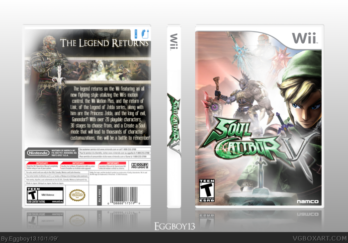
-Too much Zelda. Okay, I get it, SC games usually have cameos, but you've focused too much on the Zelda aspect instead of it being a SC box.
-Theres way too much brightness. Looks like you've dragged the sun down and stuck into your box.
-That text on that back, ugh, it just doesn't feel Soul Calibur-ish. I'd say change it to something that looks like (but isn't) times new roman or something like that.
However I will say that Logo looks dashing. Anyway, fix those things up, and I'll fave!
 Soul Calibur V Box Cover Comments
Don't ave much to say about this...
[ Reply ]
I love it except no Ivy...+ Fav anyway.
[ Reply ]
Looks nice, save for the cover logo. I'm sure there was a reason for the compromise. +fav
[ Reply ]
#2, WILL YOU STOP WITH THE IVY!!!
Edited at 1 decade ago
[ Reply ]
I think it looks great, very authentic looking. I like the addition of link as a guest character. They'd probably use someone else though since he was in SC2. Makes for a great cover character though. Nicely done.
[ Reply ]
Too much text on the back. Plus it looks more like a Legend of Zelda box.
[ Reply ]
You almost had me. I saw the icon on the page and thought this looked great. But when I came in I saw these 3 big things that I didn't like straight up.
-Too much Zelda. Okay, I get it, SC games usually have cameos, but you've focused too much on the Zelda aspect instead of it being a SC box.
-Theres way too much brightness. Looks like you've dragged the sun down and stuck into your box.
-That text on that back, ugh, it just doesn't feel Soul Calibur-ish. I'd say change it to something that looks like (but isn't) times new roman or something like that.
However I will say that Logo looks dashing. Anyway, fix those things up, and I'll fave!
[ Reply ]
I like it but I hate all the strong white glows.
[ Reply ]
I like the front design, but the back really lets it down.
[ Reply ]
I admit it, this box was a flop, if I had not included the Master sword pedastle it would have made a decent front, the back just did not fit...
Thanks for your thought everybody.
Edited at 1 decade ago
[ Reply ]
dude, you gotta send me those logos! all in all, not at all a bad box
3.5/5
[ Reply ]