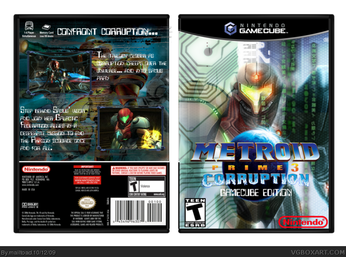
Wow, this one took me ages. I added loads of effects onto the samus at the front, and to the back. I decided to go with a computer/tv kind of style, with the transmission lines on the back. Hope you like, and comments and favs are welcome. (obviously) :P credit to qwerty334 for the temp (sorry about forgetting)
Right, OK..I like the front but think the logos to big so it distracts from the awesome wallpaper!, The back I don't like It's hard to read because of the background and it looks a bit rushed try adding a render somewhere and make the text more clearer and make the screenshot boards smaller .but all in all It's a nice box :) 3/5
It could be better. The 'Prime 3' part of the logo is pretty hard to see. The back is the flaw. I don't like the font you used for the text nor do I like the background. For the background [of the back], I'd go for more of a 'spacey' look. Also, the screens are way too big IMO. As well as the Nintendo logo on the front.
 Metroid Prime 3: Corruption GCN Box Cover Comments
Wow, this one took me ages. I added loads of effects onto the samus at the front, and to the back. I decided to go with a computer/tv kind of style, with the transmission lines on the back. Hope you like, and comments and favs are welcome. (obviously) :P credit to qwerty334 for the temp (sorry about forgetting)
Edited at 1 decade ago
[ Reply ]
Honestly, why should there be a GCN version? I mean really?
But in all, the box is appealing.
Oh, and I think you should give credit where credit is due. I believe that's qwerty or LK's temp?
Edited at 1 decade ago
[ Reply ]
I suppose they wouldn't, but I didn't think about the idea being realistic, I just tried to make an appealing boxart.
[ Reply ]
To be completely honest, it's not a bad cover, but it seems a little too busy. Then again, I tend to prefer a minimalist style.
[ Reply ]
Really nice front, but the back text need a drop shadow or glow.
Your best =)
[ Reply ]
Right, OK..I like the front but think the logos to big so it distracts from the awesome wallpaper!, The back I don't like It's hard to read because of the background and it looks a bit rushed try adding a render somewhere and make the text more clearer and make the screenshot boards smaller .but all in all It's a nice box :) 3/5
[ Reply ]
It could be better. The 'Prime 3' part of the logo is pretty hard to see. The back is the flaw. I don't like the font you used for the text nor do I like the background. For the background [of the back], I'd go for more of a 'spacey' look. Also, the screens are way too big IMO. As well as the Nintendo logo on the front.
[ Reply ]
wow its great! i like it 4/5 + fav
its a great box although the text is quite hard to read on the back other than that its great!
[ Reply ]
looks good just....why gamecube ?!?!
Edited at 1 decade ago
[ Reply ]
I like the cocept and execution of the box fav (the only problem is gamecube deition change that and it would be awesome
[ Reply ]
I like the idea and execution of it. Fav.
[ Reply ]