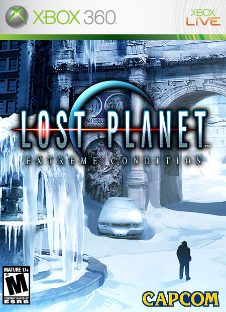
i like the logo it looks realy clear, because since its usualy the same colour as the material due to the ice theme its a realy hard logo to use but thats worked well. 4/5
If your gonna figure out what i updated, your probobly never gonna find it ;) i just moved the ESRB logo over a litle more 'cause i felt it was WAY to close the edge.

 Lost Planet Box Cover Comments
Well, don't have much to say here... but votes and comments would be wonderful.
[ Reply ]
This is my fav lost planet box; it captures the feeling of the game perfectly and isn’t clichéd at all.
[ Reply ]
:) thanx general.
[ Reply ]
i like the logo it looks realy clear, because since its usualy the same colour as the material due to the ice theme its a realy hard logo to use but thats worked well. 4/5
[ Reply ]
Thanx HellKnight :D
[ Reply ]
If your gonna figure out what i updated, your probobly never gonna find it ;) i just moved the ESRB logo over a litle more 'cause i felt it was WAY to close the edge.
[ Reply ]
*GASP* your esrb logo was a liitle close to the edge you know you were getting 5's and nobody noticed the logo being a little close
[ Reply ]
;) that's called luck
[ Reply ]
It deserved a 5 till even with the logo on the edge, its just a tiny compared to the concept.
[ Reply ]
thanx general :D
[ Reply ]
It cool but change the Rateing becusce it T not M .
4/5
[ Reply ]
I play the demo at EB games and there was no blood in the game .
[ Reply ]
I thought it was going to be M?
[ Reply ]
It was a demo so it could be added in later.
[ Reply ]
yes, maybe, right now i think it's still RP
[ Reply ]
Change it to RP then.
[ Reply ]