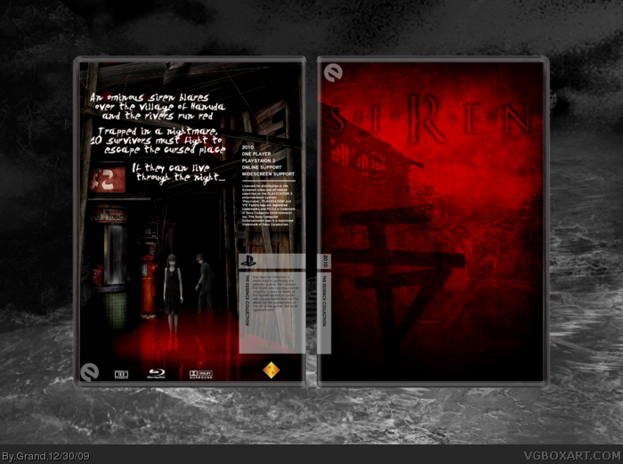
Custom made logo from scratch--did a lot of experimenting with this one. Those who played the game will recognize the symbol on the front--those who haven't....your loss; it was a fantastic game. Scary as hell. I elected to not put any 'Shibito' (zombies) on the front because I always felt that the village itself was more terrifying.
#3, why not? I think the front is very "Criterion-esque". I really like your Essence fronts, but you seem to struggle with the backs. I like the presentation on this one, by the way.
#6, Thanks--after my first Essence box which took no effort, I started working harder on them. I try to make them look simple but I usually end up with dozens of layers before I'm done.
#6, No. Essence is supposed to show the essence of the game, meaning it takes mroe effort. It's just that everyone seems to think "Minimalism!" as soon as they make an essence box.
 Siren Box Cover Comments
Custom made logo from scratch--did a lot of experimenting with this one. Those who played the game will recognize the symbol on the front--those who haven't....your loss; it was a fantastic game. Scary as hell. I elected to not put any 'Shibito' (zombies) on the front because I always felt that the village itself was more terrifying.
[ Reply ]
While I didn't like Siren (though I liked Siren: Blood Curse) I must say this is pretty well done.
Though you missed to edit PLAYSTATION 3 to PLAYSTATION 2 on the back.
Edited at 1 decade ago
[ Reply ]
I like it, although, it shouldn't be an essence.
[ Reply ]
#3, why not? I think the front is very "Criterion-esque". I really like your Essence fronts, but you seem to struggle with the backs. I like the presentation on this one, by the way.
[ Reply ]
#2, It's intended to be seen as an enhanced remake of the original Siren for the PS3. Shoulda mentioned that I guess.
[ Reply ]
#4, Because usually essence means there's usually not a lot of effort put into it. This has a lot of substance.
[ Reply ]
#6, Thanks--after my first Essence box which took no effort, I started working harder on them. I try to make them look simple but I usually end up with dozens of layers before I'm done.
[ Reply ]
Oh yeah and credit to master_general for the Essence temp and Jevangod for the box.
[ Reply ]
The front looks really good. The back is OK, but it's way to simple looking, and I really don't like the text.
[ Reply ]
#9, What don't you like about it? The font or the placement?
[ Reply ]
#6, No. Essence is supposed to show the essence of the game, meaning it takes mroe effort. It's just that everyone seems to think "Minimalism!" as soon as they make an essence box.
[ Reply ]
#11, Well I know I put effort into this one.
[ Reply ]
Printable uploaded with correct dates & platform.
[ Reply ]