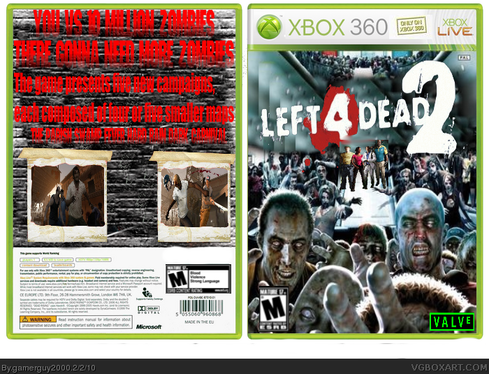
#2 i will change that
#3 i just searched left 4 dead pics on google images and that came up plain just like that i added the l4d logo valve logo and ersb and anyway why say its horrible try giving some Constructive criticism
#3 that would be very disturbing
 Left 4 Dead 2 Box Cover Comments
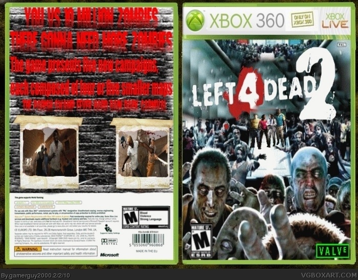
this is my first box tell me what you think and please tell me how i can improve
Edited at 1 decade ago
[ Reply ]
The front is good but the back is a little plain and I cant even read the blood text on the back.
[ Reply ]
#2, WHAT? Both sides are horrible.
Also, why is the front Deadrising? You should use Left 4 Dead 2 art on a Left 4 Dead 2 box. Thats like using Mario art on a Sonic box.
[ Reply ]
#3, Or Silent Hill art on a hannah montana box.
[ Reply ]
#2 i will change that
#3 i just searched left 4 dead pics on google images and that came up plain just like that i added the l4d logo valve logo and ersb and anyway why say its horrible try giving some Constructive criticism
#3 that would be very disturbing
[ Reply ]
If you are going to use art from other games make sure it's not a well known game and try to keep it simple
[ Reply ]