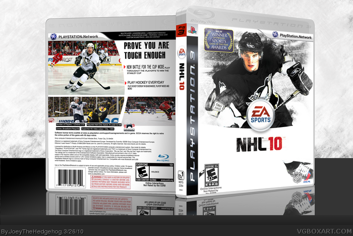
Huh, nice effect on the front, i've had a few goes at it and its not an easy one to figure out, nice work there. But the back lets it down a bit. The kerning on the blurb and the blurb itself aren't too crash hot. Needs some more points added to it, 'Be A GM' mode would go in well as its new addition to the game. I like the screen shots though, shows a bit more action than what the official does.
 NHL 10 Box Cover Comments
You sure you don't mean NFL 10?
[ Reply ]
How did you do that scratchy effect?
[ Reply ]
This looks very professional
[ Reply ]
Huh, nice effect on the front, i've had a few goes at it and its not an easy one to figure out, nice work there. But the back lets it down a bit. The kerning on the blurb and the blurb itself aren't too crash hot. Needs some more points added to it, 'Be A GM' mode would go in well as its new addition to the game. I like the screen shots though, shows a bit more action than what the official does.
#5, way to fly under the radar.
Edited at 1 decade ago
[ Reply ]
looks a lot like mine link but I do think your front is better
[ Reply ]
#5, Ehm, that's a pretty normal style for a NHL-game, and it wasn't your idea to do that.
[ Reply ]
I know, but since he looked and commented on mine, I was just wondering.
Edited at 1 decade ago
[ Reply ]
Nice but make the logo bigger. Too much empty space at the bottom.
[ Reply ]
thanks everyone, and #8, i'll fix the logo
[ Reply ]
#2, use scratch brushes for gimp or photoshop
[ Reply ]
Love the box man! Keep up the good work.
[ Reply ]
#11, thanks
[ Reply ]