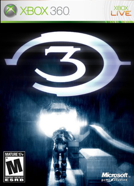
Suggestions:
1. Halo 3 logo needs to be a little bit more flattened, just a little.
2. Mature logo needs to be a bit smaller.
3. Bungie logo needs to have white text.
4. And if you can, try removing the Chief from the picture by using the healing brush; he doesn't need to be on there.
Sweet, but make the Halo logo less tall, it looks... well, fat. Also, make the "M for Mature" logo smaller. What I usually do when designing boxes is scan a real one and use it as a template. If you have a scanner, try it. :)

 Halo 3 Box Cover Comments
yes its finally done. i found the picture on bungie.net. i still have the on i posted in forums ill post tht later.
[ Reply ]
i think it would be awesome as a collectors edition, but for the actualy halo 3 box, it seems too simple, but still, i love it non-the-less 4.5/5
[ Reply ]
#2, y thank you bob ill make it collectors edition.
[ Reply ]
wheres the bungie logo man
[ Reply ]
#4, good point i forgot tht
[ Reply ]
This is absolutely amazing!!! 5/5!! I commend you for not using the halo 3 trailer!!!
This is great for a collectors edition box, it is just.. great..!!
[ Reply ]
#6, why thank you very much vekta
[ Reply ]
3.5/5
Suggestions:
1. Halo 3 logo needs to be a little bit more flattened, just a little.
2. Mature logo needs to be a bit smaller.
3. Bungie logo needs to have white text.
4. And if you can, try removing the Chief from the picture by using the healing brush; he doesn't need to be on there.
[ Reply ]
wow! this is amazing! its sumething other than the traeler pics! it looks really good!
5 out of 5!
[ Reply ]
Sweet, but make the Halo logo less tall, it looks... well, fat. Also, make the "M for Mature" logo smaller. What I usually do when designing boxes is scan a real one and use it as a template. If you have a scanner, try it. :)
4.5
[ Reply ]
good job!~!~!~!~!~! and yea the "M for Mature needs to be smaller"
[ Reply ]