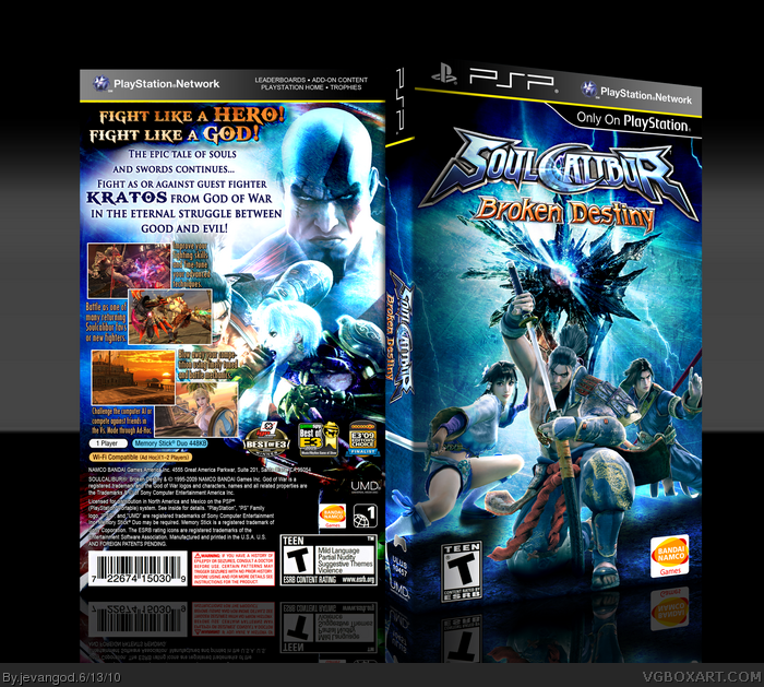
Ok I was looking through the site to see if anyone made a Broken Destiny box and I found 1 and everyone thought it was an alt of me. I was like what!!! Guys I promise you that was not an alt account of me. That box was good, but I post all my boxes on my Deviant art account and as you can see that box is not on there. So I just wanted to get that out there. Well anyways I wanted to try something different with this game. The official is very good looking and I just wanted to be atleast as half as good as it.
Ohh and if your wondering how I made this so fast. Well... I didnt make it fast. I finished it yesterday. I started it like 4 days ago cause the website wasnt letting us posting boxes so... I just said I mine as well get started on my next box.
Holy hell this is excellent, Jevan. Front is perfect, the character arrangements, colors, textures, and Soul Edge in the background. It's all top-quality stuff, one of my favorites from you.
Back layout is impressive too, though I don't like Mitsurugi's face being half-hidden by the screenshot. If possible I'd move both Ivy and him over to the right a bit. And the colors are a bit over-saturated on the back as well.
Edit: well, that's my reaction to the box. which is good, As you can see i faved xD. though, I have a question.why is the line on the psp bar above(the template) yellow? do they make 'em like that now?(i'm not really aware of these things now that college's had me busy) Cause its little too bright, maybe a little more mustard-ish would work better
 Soul Calibur: Broken Destiny Box Cover Comments
Ok I was looking through the site to see if anyone made a Broken Destiny box and I found 1 and everyone thought it was an alt of me. I was like what!!! Guys I promise you that was not an alt account of me. That box was good, but I post all my boxes on my Deviant art account and as you can see that box is not on there. So I just wanted to get that out there. Well anyways I wanted to try something different with this game. The official is very good looking and I just wanted to be atleast as half as good as it.
Ohh and if your wondering how I made this so fast. Well... I didnt make it fast. I finished it yesterday. I started it like 4 days ago cause the website wasnt letting us posting boxes so... I just said I mine as well get started on my next box.
Edited at 1 decade ago
[ Reply ]
Holy hell this is excellent, Jevan. Front is perfect, the character arrangements, colors, textures, and Soul Edge in the background. It's all top-quality stuff, one of my favorites from you.
Back layout is impressive too, though I don't like Mitsurugi's face being half-hidden by the screenshot. If possible I'd move both Ivy and him over to the right a bit. And the colors are a bit over-saturated on the back as well.
[ Reply ]
#2, Thanks. I really appreciate it. Ill see if I can fix the things you mentioned tonight.
[ Reply ]
Ummmm yes.
[ Reply ]
Wow, probably one of your best.
[ Reply ]
Do you use a gradient to make those corners seem softer?
[ Reply ]
Fantastic Job.
[ Reply ]
#6, Yea.
[ Reply ]
Hm.
Edit: well, that's my reaction to the box. which is good, As you can see i faved xD. though, I have a question.why is the line on the psp bar above(the template) yellow? do they make 'em like that now?(i'm not really aware of these things now that college's had me busy) Cause its little too bright, maybe a little more mustard-ish would work better
Edited at 1 decade ago
[ Reply ]
#9, They are making them like this now.
[ Reply ]
The sub-description font. you used for the back looks odd, cool box.
[ Reply ]
DAMN that's nice!
[ Reply ]
#11, Hmmm. I thought it fit pretty well.
[ Reply ]
#11, Full view.
[ Reply ]
wow, pretty epic, man.
[ Reply ]
Printable added.
[ Reply ]