I don't like what you did with the logo at all. You can barely read what it says. Not really sure why you have two of them either. Everything else isn't bad, but the tagline looks kinda odd.
Considering the originality and creativity of the front (great use of colors, and lack of) I'd suspect using a similar idea for the back would have resulted in something better. I really do like the front, but the back is rather bland at the moment.
 Homefront Box Cover Comments
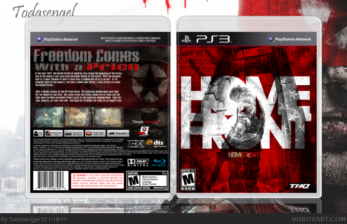
Here is my Homefront Cover. This took a while to do but I think I finally got it the way I wanted.
Logo:Spiderpig24
Thanks for the help guys! drunkenmoonkey, deiv, drew, echos of life.
[ Reply ]
I don't like what you did with the logo at all. You can barely read what it says. Not really sure why you have two of them either. Everything else isn't bad, but the tagline looks kinda odd.
[ Reply ]
I love the logo...
[ Reply ]
Thank youuuuuuuu lol Someone appreciates it! lol I could have stuck with the same old one that EVERYONE uses lol
[ Reply ]
I also had a hard time reading the logo. I had to look at the boxes title to figure it out, mostly cause you don't have holes in your typeface.
but I think your originality is there and you have improved. I would love to see more boxes.
[ Reply ]
Considering the originality and creativity of the front (great use of colors, and lack of) I'd suspect using a similar idea for the back would have resulted in something better. I really do like the front, but the back is rather bland at the moment.
[ Reply ]
I agree with sd1833. It is a really unique and creative idea and personally I love what you did with the logo and the colour scheme. Its awesome.
[ Reply ]
#7, Thanks man!
[ Reply ]