yipes... first, i dont like how the logo looks, second, masterchief looks like he's hiding from something, third, you shouldn't gave made the drop shadow so distant on the logos, fourth, where are all the other logos?? (i.e. rating, bungie, microsoft)
why does this look diffrent on the front page then it does here?? i like this one better tho frome what i can see..but not the best
:P mines better lol

 Halo 3 Box Cover Comments
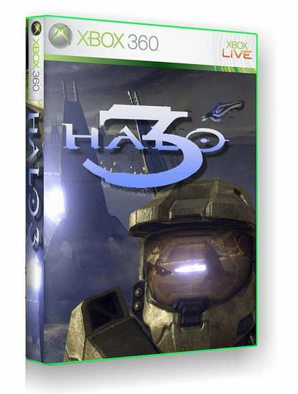
heres my halo 3 box enjoy
and vote THANX
[ Reply ]
yipes... first, i dont like how the logo looks, second, masterchief looks like he's hiding from something, third, you shouldn't gave made the drop shadow so distant on the logos, fourth, where are all the other logos?? (i.e. rating, bungie, microsoft)
[ Reply ]
youre welcome for the logo
[ Reply ]
sorry thanx man
[ Reply ]
all problems fixed please rate now THANX
[ Reply ]
version one was not that great, but nice recovery
[ Reply ]
the logo is still bad... why are HALO and the 3 blended into one layer? and that image is waaaaay overused.
[ Reply ]
why does this look diffrent on the front page then it does here?? i like this one better tho frome what i can see..but not the best
:P mines better lol
[ Reply ]
#8, no actually mine took time unlike yours
[ Reply ]