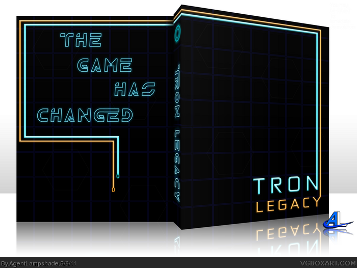
Okay, here's a nice, simple box with no legal info. Tried to capture the most iconic (In my opinion) part of the movie and leave it nice and simple. This is what I came up with, so thanks for viewing.
I think the front is perfect. The emptiness doesn't bother me me because of the great position of the logo and border- your eyes get dragged out. Perfect.
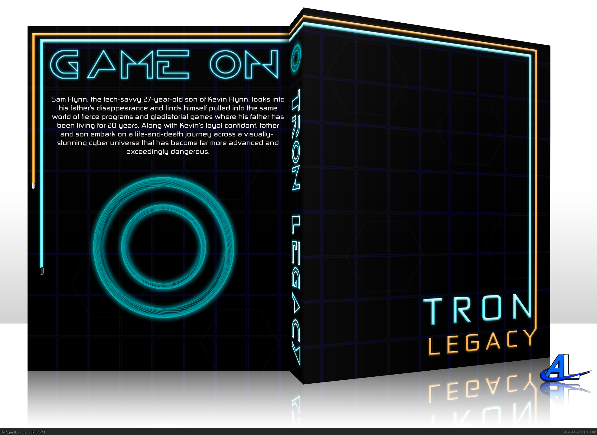
The back really doesn't go though. I think something a lot more simplistic would be a better approach for a box like this. Not advertising my work but if you take a look at a couple of my more recent boxes you will see what I mean by simpler backs.
I love the use of Light Cycle lines, traveling across the box. Despite the explosive visual effects throughout the movie, minimalism just seems to work with Tron Legacy.
 Tron: Legacy Box Cover Comments
Okay, here's a nice, simple box with no legal info. Tried to capture the most iconic (In my opinion) part of the movie and leave it nice and simple. This is what I came up with, so thanks for viewing.
[ Reply ]
OOOOO neon...
looks sweet, but I'd higher the visibility of the grid on the back and cover, because it's not INSTANTLY noticeable.
edit
Edited at 1 decade ago
[ Reply ]
this is a little too plain. doesnt really make an impact
[ Reply ]
I think the front is perfect. The emptiness doesn't bother me me because of the great position of the logo and border- your eyes get dragged out. Perfect.
The back really doesn't go though. I think something a lot more simplistic would be a better approach for a box like this. Not advertising my work but if you take a look at a couple of my more recent boxes you will see what I mean by simpler backs.
[ Reply ]
Looks too much like the first movie though, even if you were trying to capture the original feel. Still great design.
[ Reply ]
This is inspiring me...
[ Reply ]
This is nice, but then again I'm always a sucker for minimalism.
[ Reply ]
Thanks everybody.
I'll take a look at some of your stuff tmrd and see what I come up with. Thanks everybody for the advice.
#9, it is? Thanks for letting me know.
Edited at 1 decade ago
[ Reply ]
It's good, but the Tron Legacy font is available now, I'd suggest at least writing the side text with that one instead. :)
[ Reply ]
Update: Got rid of the back description and went for a more minimalistic style like the front. Again, thanks everyone for the advice.
[ Reply ]
I love the use of Light Cycle lines, traveling across the box. Despite the explosive visual effects throughout the movie, minimalism just seems to work with Tron Legacy.
[ Reply ]