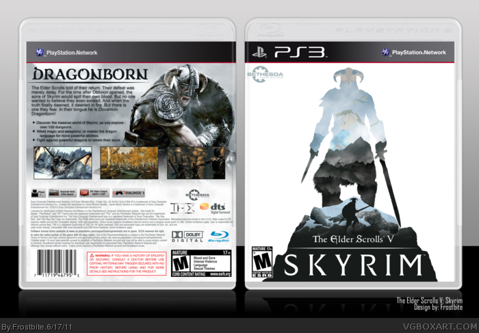
I like it. I think it would be a whole lot better if you used a different silhouette on the front that isn't so redundant. You got that Nord dude depicted like three times on the box.
Also, the typography on the back could be a little more attractive and you could spice up those screen shots a bit with some borders or some shit.
I like it, but the styles of the front and back kinda clash. Like, the front is Custom made, sharp, silhouette like. The back looks more official with 3D renders and images. Still, it is awesome.
Who whoa hey. Don't delete your account. This is fantastic for a first heck, it's fantastic for even a Veteran. Really great job you did here. Honestly, it's very professional and clean. Good work!
Great job on this! I love the front to bits. The images in the silhouette look really good.
Tips: I think maybe you should move the bullet points to correspond with screenshots on the back and then maybe add some kind of image (other than a screenshot - like maybe a dragon tail attacking him?) in the spot there.
Other than that I think you did a fantastic job :-D
#9, hey, it's the most amazing box I've seen in ages, if you delete it I will literally cry. I'll FAV and Author FAV you because amazing new members are few and far between
I agree with Ronthis the Werewolf, the art styles don't really match,
but what the heck! it doesn't really matter, you've created a nice and clean box.
 The Elder Scrolls V: Skyrim Box Cover Comments
I had a really great time making this :D
It was so much fun, so i hope you like it too! :)
The art on the front was all made by me
I want to submit this for the Theme of the Month contest too! Did I do that right?
Thank you to deiviuxs for the Playstation 3 template and to Spiderpig24 for the Bethesda Games logo!
Edited at 1 decade ago
[ Reply ]
Clean, pure, and effective. Great job!
[ Reply ]
This is amazing, it's great to see more great artists appear on here. I hope to see more from you!
[ Reply ]
I like it. I think it would be a whole lot better if you used a different silhouette on the front that isn't so redundant. You got that Nord dude depicted like three times on the box.
Also, the typography on the back could be a little more attractive and you could spice up those screen shots a bit with some borders or some shit.
[ Reply ]
thank you for the advice pigeon_face! I will update the cover with those improvements! :)
[ Reply ]
Pretty remniscent of this: link
Nice, though I don't like the Bethesda logo being placed there, and the back looks rather unispired and boring.
[ Reply ]
I like it, but the styles of the front and back kinda clash. Like, the front is Custom made, sharp, silhouette like. The back looks more official with 3D renders and images. Still, it is awesome.
[ Reply ]
Manuel_Alejandro95 is the back really boring? :( I dont know how to make it not boring :(
[ Reply ]
Im sorry but I dont know how to make it better :( I tried your ideas but I dont know how to change it :(
Can I delete my account? Im sorry for submitting bad covers :(
[ Reply ]
I like the back a lot, but I'm not a fan of the style of the front.
[ Reply ]
Who whoa hey. Don't delete your account. This is fantastic for a first heck, it's fantastic for even a Veteran. Really great job you did here. Honestly, it's very professional and clean. Good work!
[ Reply ]
#9, woah woah woah buddy.
It's obvious you have a ton of talent. This is a much better box than I'll ever make. Don't delete your box yet.
[ Reply ]
Great job on this! I love the front to bits. The images in the silhouette look really good.
Tips: I think maybe you should move the bullet points to correspond with screenshots on the back and then maybe add some kind of image (other than a screenshot - like maybe a dragon tail attacking him?) in the spot there.
Other than that I think you did a fantastic job :-D
PS: PLEASE don't delete your account!
Edited at 1 decade ago
[ Reply ]
#9, hey, it's the most amazing box I've seen in ages, if you delete it I will literally cry. I'll FAV and Author FAV you because amazing new members are few and far between
[ Reply ]
#9, Don't do that, please don't do that.
This box is amazing, I have hopes that it will be HoF eventually.
[ Reply ]
Slickk.
[ Reply ]
Very nice, especially for a first!
[ Reply ]
#9, bit dramatic, don't you think?
[ Reply ]
Kudos on the front. It's refreshing to see more creative ideas submitted to the site.
[ Reply ]
Front is creative, I like it!
[ Reply ]
I agree with Ronthis the Werewolf, the art styles don't really match,
but what the heck! it doesn't really matter, you've created a nice and clean box.
Edited at 1 decade ago
[ Reply ]
I still think this is great, especially the front!
This needs more attention.
[ Reply ]