wow buell, you really overratted this box.
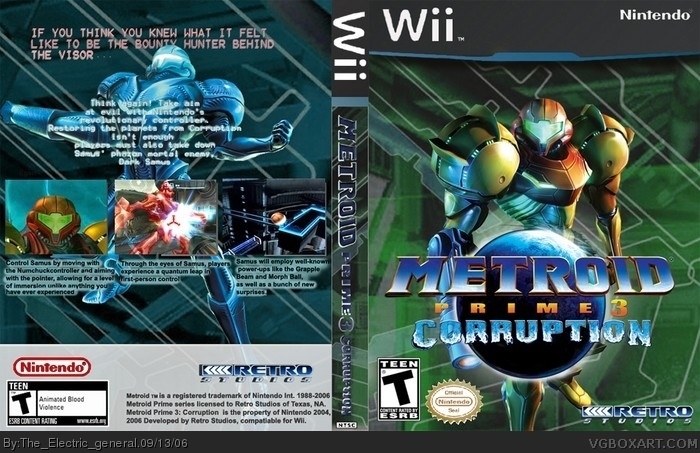
first of all, the front and back covers are blurry and boring, and going for realism, the lower back is very bad, but i can see you tried.
further, the spine is horrible, as is the template.
Samus herself is nicely cut out, and the main logo isn't bad either.
i could keep going, but i'm just gonna stop there and give it a 3.
sorry, but you;re capable of a lot better.
Do you see it full-view?
anyway the bottom is too short, but that ok. I think is better to make it short, than to have it longer with hella a lot of blank space.
but you make some good points, Wicked Gamer. I'll change my score from 5/5 to 4/5 due to I was in an rush and didn't see the full details.
sorry if this upsets you EG, but know you, you won't. ^-^
 Metroid Prime 3: Corruption Box Cover Comments
Check full size so you can read it better, thanks.
[ Reply ]
cool, I like it. Everything's good. This is some of your better work.
5/5
[ Reply ]
wow buell, you really overratted this box.
first of all, the front and back covers are blurry and boring, and going for realism, the lower back is very bad, but i can see you tried.
further, the spine is horrible, as is the template.
Samus herself is nicely cut out, and the main logo isn't bad either.
i could keep going, but i'm just gonna stop there and give it a 3.
sorry, but you;re capable of a lot better.
[ Reply ]
Do you see it full-view?
anyway the bottom is too short, but that ok. I think is better to make it short, than to have it longer with hella a lot of blank space.
but you make some good points, Wicked Gamer. I'll change my score from 5/5 to 4/5 due to I was in an rush and didn't see the full details.
sorry if this upsets you EG, but know you, you won't. ^-^
[ Reply ]
A few things: The template is a bit weird, the Nintendo seal was cut badly, and the text across Dark Samus is hard to read.
BUT, I absolutely LOVE the front. It's a definite throwback to Prime's artwork.
3.5/5
[ Reply ]
Scratch that...3.5 is a bit low. I upped it to a 4.
[ Reply ]
hey i like the wii template...very cool and so is the front. back could use a little improvement, but this is good. 4/5
[ Reply ]