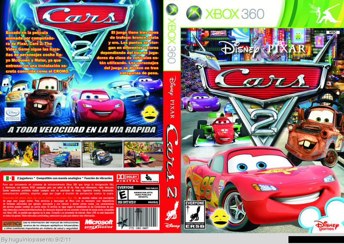
I'm a little confused with the fairy and the guy with the sword in the top right, the cats, and the star on the bar code. The text also doesnt look right. All in all, i agree with #2, the box had so much potential, but it needs just a little more work
#1 and #4 Too bad, maybe try it with google chrome. I have also trying to see them with internet explorer but does not work. Only with google chrome. I do not understand that.
#5 I put many personal logos, because in my country people find boxes in the network and copied for pirated products. I hope so, it takes more work and will be more difficult to duplicate. That's the main reason why so many logos.
#7, Alright that sounds a bit more logical, but it doesn't really explain that hideous yellow/red outlined font you always use on the back of your boxes :/ Sorry for saying so, but if you want to improve, I suggest turning the
synopsis of your boxes into a neutral color.
Maybe they like that kinda bright colors in your country, but I really want to take a step back as I'd like to read the back text (even if I don't understand a word of it) so even if it is your style of work, it really doesn't work at all in terms of readability.
 Cars 2 Box Cover Comments
For some reason I cannot see any of your boxes, all colours are inverted.
[ Reply ]
The front is pretty good, but don't get me started on the back :/
it looks all a bit desaturated, but the composition is pretty good.
That yellow fellow, the cat and that yellow/red outlined font,
really kills the box, again :/ to bad, because it has potential.
[ Reply ]
#2, this.
It's quite good though.
[ Reply ]
#1, I Can't Either. O_O
[ Reply ]
I'm a little confused with the fairy and the guy with the sword in the top right, the cats, and the star on the bar code. The text also doesnt look right. All in all, i agree with #2, the box had so much potential, but it needs just a little more work
[ Reply ]
#1 and #4 Too bad, maybe try it with google chrome. I have also trying to see them with internet explorer but does not work. Only with google chrome. I do not understand that.
[ Reply ]
#5 I put many personal logos, because in my country people find boxes in the network and copied for pirated products. I hope so, it takes more work and will be more difficult to duplicate. That's the main reason why so many logos.
[ Reply ]
#7, aah. I see.
[ Reply ]
#7, Alright that sounds a bit more logical, but it doesn't really explain that hideous yellow/red outlined font you always use on the back of your boxes :/ Sorry for saying so, but if you want to improve, I suggest turning the
synopsis of your boxes into a neutral color.
Maybe they like that kinda bright colors in your country, but I really want to take a step back as I'd like to read the back text (even if I don't understand a word of it) so even if it is your style of work, it really doesn't work at all in terms of readability.
Edited at 1 decade ago
[ Reply ]
#7, thanks for explaining that
[ Reply ]