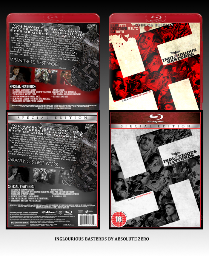
This took me ages, i made the collage from scratch and the template is jevangods,also thanks to Bastart for all your help in the forums.
[ Box updated on January 25th, 2012 ] [ original ]
 Inglorious Basterds: Special Edition Box Cover Comments
Comment on AB501UT3 Z3R0's Inglorious Basterds: Special Edition Box Art / Cover.
The back's a bit too text-heavy for my liking, but I really like the front, kudos on making the collage.
I feel a different font and less text would help readability on the back.
[ Reply ]
I agreed with AgentLampshade. I love what you have done with the front, it's look really professional. But you should change the font on the back...
faved it anyway
[ Reply ]
I quite like the special edition front, but the normal front is a little too bright of red and both backs are very text-heavy as Laampshade said.
[ Reply ]
This could be excellent if only you removed the huge glow on the back text and skimmed it down a little.
Do such, and I'll return with a favourite :)
[ Reply ]
I agree with Silent O, You should skim down the text and make the outline around the text much lighter, forgot to mention it at the WIP.
[ Reply ]
I think the presentation detracts from the box. The box itself is actually very well made (bar the text heaviness). I think just either the sleeve or box would make it more eye-catching.
[ Reply ]
The front is great but that back text is way to much. One it's all caps in a hard to read type font. Not illegible but hard to read large bodies of text with a font like that. Remember body text is simple text, don't over design on text. Try to use a font that looks like the logo, you have a country western style font. Use a thin sans serif body text with a blocky serif text as the tag line, the two make a great combination.
Also don't use glow on that much text, mind as well have black background at that point. If you use lowercase with a thinner font you will require less space and will be able to fit it with in that dark space below the wing and will look clearer. Great front, I would love to see a back that flows with it more.
[ Reply ]
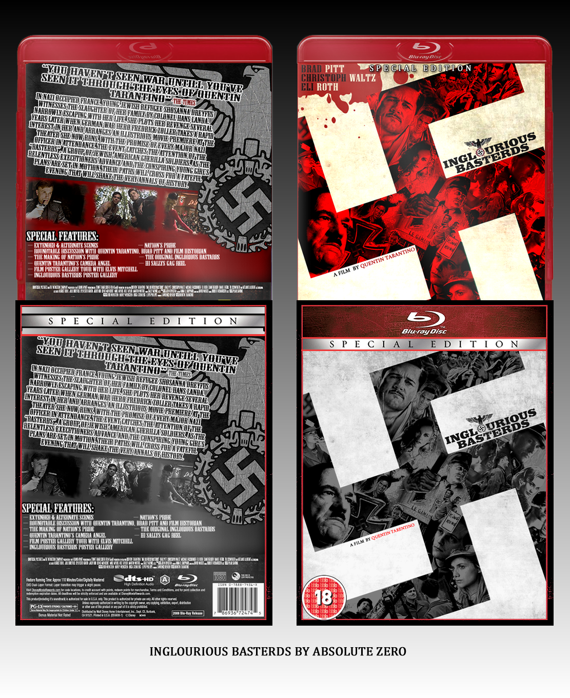
UPDATE V2
[ Reply ]
I think you should make the font size just a bit smaller so it's still easy to read, but takes up a lot less space than it does at the moment (it looks kinda forced between the quote and the screens) I''ll defitinely fave if you change it.
[ Reply ]
Not that you have to do this, but I personally think the front is the best part and a couple ideas that came to mind to make the fronts style flow through the whole box would be maybe taking the swastika bird and making him the screen shots and lowering the text below it's wing so the bird looks like the front. You could even use the fronts color with a black text. Also I would use a font similar to the logo or the back text on the special features too. I prefer the bottoms front without the actors names in blood. If you want to add their names make it subtle like you did with "A film by..."
Great update.
[ Reply ]