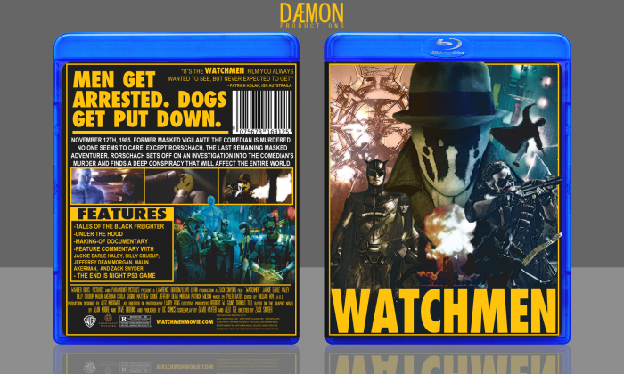
Dat orange-blue contrast.
Anyways, the front was clearly inspired by Drew Struzan. I really love it. The back is okay. It's not so great but I just kind of threw it together.
Credz to jevangod for the template.
 Watchmen Box Cover Comments
Comment on Daemon's Watchmen Box Art / Cover.
As a huge fan of Watchmen I love this box! Looks very clean and official
[ Reply ]
Thanks!
[ Reply ]
Sexy
[ Reply ]
Me or the box?
[ Reply ]
I'm not sure if I'm a fan of the effects and (Lack of) contrast, but it's pretty nice.
Good work, I love the watchmen :3
[ Reply ]
Glad you like it.
[ Reply ]
Im actually not a big fan of the effects on the front at all and personally not a fan of the movie (i know i know) but this is still pretty kick ass. Love the color use on the front
[ Reply ]
Appreciate it, man.
[ Reply ]
Awesome!
[ Reply ]
Thanks!
[ Reply ]
Amazing, I love it!
[ Reply ]
Thank ya.
[ Reply ]
You shall look up and shout 'fav my Watchmen box!' and I shall whisper 'yeah sure, it's pretty awesome.'
;)
[ Reply ]
:D
[ Reply ]
I love this!
[ Reply ]
I think the front comes off as messy. The colors don't match, which makes everything look poorly cut out and out of place, and the effect you have on the pictures is kind of ugly.
The back has potential, but capital letters seem like overkill in the description, and Doctor Manhattan's head looks really weird over that screenshot.
[ Reply ]
I think there's way too much yellow, especially on the back. Yes, I know it's Watchmen, but it would be nice to see it portrayed in a more unique representation. As for the front, I do like what you have but the back, again, is too yellow for me.
[ Reply ]
Very beauty, Good work man :D
[ Reply ]