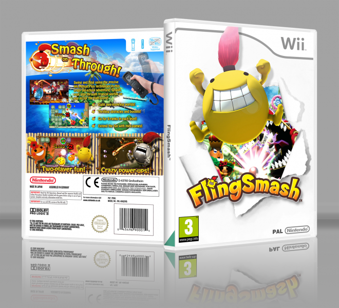
I really enjoyed working on my last submission and decided to make a real game box this time. FlingSmash might seem like an odd choice, but I'm planning to buy it used soon, so I guess that is why I had it on my mind.
I'm really happy with the final result, the back and front might not be a perfect match, as I didn't come up with any good way to use the same theme for the back. On their own I think they are pretty good though.
Thanks to 0utcast and Sarashi for the templates.
 FlingSmash Box Cover Comments
Comment on Gammax's FlingSmash Box Art / Cover.
Looks really nice to be honest. A bit plain because of the white, but still you've really made the effort. And while I do agree that the back and front do not go together, it would be plain to carry over the white to the back.
On a negative note, the screenshots on the top of the back look really sharp cornered; you might want to round them off to make it looks better. You could also use the logo of the front on the side to make it look better and less plain and bland (I know it doesn't look as official when you do). And please do give credit for the template next time.
[ Reply ]
Thanks! I appreciate the feedback, I'll consider rounding off the corners in the future. As for the logo on the side, it never is used on first-party games in Europe, and I went for the official look.
Totally forgot to give credit though, don't know how it slipped my mind... Thanks for the heads-up!
[ Reply ]
Awesome job!
[ Reply ]
Looks really great and official. Awesome job! Deserves definitely more attention and more favs.
[ Reply ]
You've done well here.
[ Reply ]