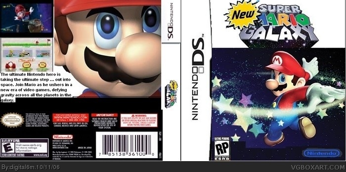
Resons why
1. It say RP on the fornt and E on the back
2. The pic is burry
3. The text is really bad
4. Why is the nintedo logo bule
5. The logo is badly cut out .
1. learn to use photoshop/or anything better
2. know that black jaggedy corners are bad
3. Check logo and make sure that is POLITICALLY CORRECT!
4. atleast make sure that you colors match...
#10 -sigh- You're not going to get better which an atitude like that seriously when you're making your next box just post it in the forums and people will help you, Just try and get GIMP (It's free) or mayjorly improve in Paint. Sure they might not be super awsome like WG1's boxs but it is possible to make alright boxes, liek I did with my first one, link (<--- I did taht on paint. ^.^
As for the box, I really don't beleive you put an hour into this even with Paint, why?
-Because it's just pictures taken off of Google and put together.
-You didn't want to have to cut the logo out so you just cut the top off of the wallpaper you used.
-Nothing is cut out, at all.
1/5, you have a lot of improving to do, but you should get better some day.
Its pretty good for an hour of work, but it looks unfinshed. I dont like the white parts next to the logo andthe screenshots and font are pixelated heavily in the back. The idea isnt bad, just finish
 New Super Mario Galaxy Box Cover Comments
i know what your gonna say :(
[ Reply ]
It took me an hour to do this
[ Reply ]
#2, what program are you using ?
[ Reply ]
Its paintshop, isnt it?
[ Reply ]
This is really bad ...sorry .
Resons why
1. It say RP on the fornt and E on the back
2. The pic is burry
3. The text is really bad
4. Why is the nintedo logo bule
5. The logo is badly cut out .
1.5/5
[ Reply ]
For you next boxart try grimp out .
link
[ Reply ]
i feel sorry foy you because you put loads of effort into your boxes but you use paint. hence i'm not going to vote
[ Reply ]
I respect that you put a lot of effort into this, but I don't respect that you won't get gimp. 1.5/5
[ Reply ]
1. learn to use photoshop/or anything better
2. know that black jaggedy corners are bad
3. Check logo and make sure that is POLITICALLY CORRECT!
4. atleast make sure that you colors match...
1/5
[ Reply ]
i suck im never gonna be good
[ Reply ]
#10 -sigh- You're not going to get better which an atitude like that seriously when you're making your next box just post it in the forums and people will help you, Just try and get GIMP (It's free) or mayjorly improve in Paint. Sure they might not be super awsome like WG1's boxs but it is possible to make alright boxes, liek I did with my first one, link (<--- I did taht on paint. ^.^
[ Reply ]
wow. 1/10
[ Reply ]
is that going to happen
[ Reply ]
#13, it hasn't been announced, probably not.
As for the box, I really don't beleive you put an hour into this even with Paint, why?
-Because it's just pictures taken off of Google and put together.
-You didn't want to have to cut the logo out so you just cut the top off of the wallpaper you used.
-Nothing is cut out, at all.
1/5, you have a lot of improving to do, but you should get better some day.
[ Reply ]
it's not even old why should it be new it's not even diffrent. it's not good
[ Reply ]
This isn't absolutely perfect but nice idea.
[ Reply ]
#16, -_-
why did you bump this?
[ Reply ]
Its pretty good for an hour of work, but it looks unfinshed. I dont like the white parts next to the logo andthe screenshots and font are pixelated heavily in the back. The idea isnt bad, just finish
[ Reply ]