This is a really clever and clean design. The colours seem to all go with a cyan/turquoise look, and the placement of the text and images are placed awesomely.
Easily a favourite. One of the best Halo 4 boxes I've seen.
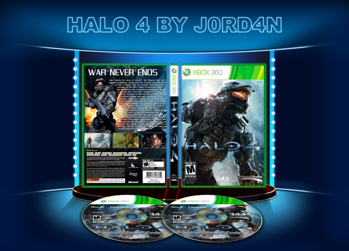
Also (sorry for double post) at the end of the blurb on the back, you've left a [14] there. Probably get rid of it and make sure you take more care before copying and paste from Wikipedia ;)
 Halo 4 Box Cover Comments
Realy Nice, +Fav...
[ Reply ]
thx!!
[ Reply ]
great work please add printable
[ Reply ]
This is a really clever and clean design. The colours seem to all go with a cyan/turquoise look, and the placement of the text and images are placed awesomely.
Easily a favourite. One of the best Halo 4 boxes I've seen.
[ Reply ]
Also (sorry for double post) at the end of the blurb on the back, you've left a [14] there. Probably get rid of it and make sure you take more care before copying and paste from Wikipedia ;)
[ Reply ]
man great work, well done:)
[ Reply ]
Fucking sweet man
[ Reply ]
I really like(:
[ Reply ]
thx for all the comment mate!!
printable added with no "[14]"
[ Reply ]
muito bom recomendo
[ Reply ]