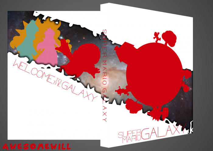
Man I wish you didnt rush so much with your boxes. This and the last one you did had so much potential and really nice ideas but you are in such a hurry to just post them that it ruins the boxes. If you spent more time on this, you could have made this look great. But right now, the logo would look better if it put it more to the left so the Y isnt covered up. Some kind of lighting and texture would have been used on the red on the front. The space image in the background does not work well. And the back is a bit boring and could have been spiced up a lot more.
Take your time with these, because you really do have some nice ideas just need to put more effort in the outcome.
You're right. I'm not going to start over, but I'm going to work on this. I think I have an idea for a texture I can use and I'll get rid of the space thing. I'll work on figuring out something to do with all the white.
 Super Mario Galaxy Box Cover Comments
Man I wish you didnt rush so much with your boxes. This and the last one you did had so much potential and really nice ideas but you are in such a hurry to just post them that it ruins the boxes. If you spent more time on this, you could have made this look great. But right now, the logo would look better if it put it more to the left so the Y isnt covered up. Some kind of lighting and texture would have been used on the red on the front. The space image in the background does not work well. And the back is a bit boring and could have been spiced up a lot more.
Take your time with these, because you really do have some nice ideas just need to put more effort in the outcome.
[ Reply ]
This.
[ Reply ]
You're right. I'm not going to start over, but I'm going to work on this. I think I have an idea for a texture I can use and I'll get rid of the space thing. I'll work on figuring out something to do with all the white.
[ Reply ]
Nice
[ Reply ]
printable please
[ Reply ]