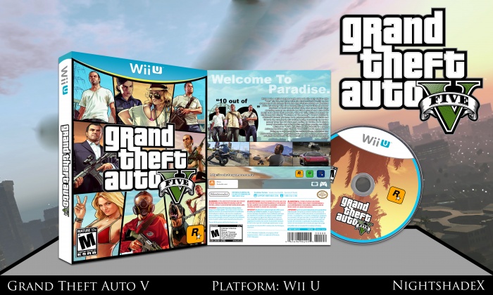
Here's preparing for the inevitable: Grand Theft Auto V on Wii U. Also included a printable for those who do pick this up for said console. Comments and critique highly appreciated! Thank you also for those who helped in the WiP thread as well and to Hades for the sexy official template. Please view in full!
[ Box updated on December 13th, 2012 ] [ original ]
 Grand Theft Auto V Box Cover Comments
Comment on NightshadeX's Grand Theft Auto V Box Art / Cover.
Hoom, nice...
[ Reply ]
Thank you :) glad you like it!
[ Reply ]
Nice work !
[ Reply ]
Thanks! :)
[ Reply ]
GOod WOork . . .
[ Reply ]
Thank you kind sir
[ Reply ]
Very good ...
[ Reply ]
Thank you!
[ Reply ]
The first and the image right above it (in the left bottom corner) of the front cover, seems to be kinda squashed. The tagline, could use more contrast (maybe you could try and make it white with a black outline, just like in the GTA V logo?) The box looks a bit generic, but quite official.
[ Reply ]
Cho said the same thing but again, they're not stretched out. I made sure to keep the dimensions in line when they were being resized. I'm not sure about the tagline on the back since I wanted it to flow together with the sky but I can try a few things out :)
[ Reply ]
You need to go easy on the text in the back's design. Arial black isn't the best choice for body text and the choice of the paragraph's format makes it a chore to read and degrades the design's overall quality.
It's all about placement of the text, the choice of font, and getting the game's selling point across using an adequate number of words as the game should need. Not too much since it'll drive people away, and not too little since people will have little idea of what the game is about.
I do like how you arranged the layout of the tagline. It's simple, legible, and aesthetically pleasing with it saturating the sky.
Also this will sound like some sort of a nitpick, but the ESRB rating in the back is misplaced, and it's overlapping the legal information. Organization is one of the major keys to a great design.
The front's pretty much like every other GTA boxart I've seen, so it's not bad. The whole design isn't bad, but you just need to improve on the typography a bit, and you'll be fine.
[ Reply ]
I repositioned the ESRB on the back. I chose Arial Black for the back's font because it flows well with the overall design and the logo on the front
[ Reply ]
Updated to v2! Repositioned the ESRB rating on the back and tweaked the characters on the front.
[ Reply ]
nice
[ Reply ]
Nice work, looks official.
[ Reply ]
Thank you kind sir!
[ Reply ]
Not too shabby, however, some images are stretched and low quality. Tagline on the back could also stand out more from the blue background.
[ Reply ]
I like it :) what did you use to make this?
[ Reply ]
Thank you :) I used Adobe Photoshop CS6
[ Reply ]
OMG! I tried making one of these but it's no where as good as this! I'll post it.
[ Reply ]