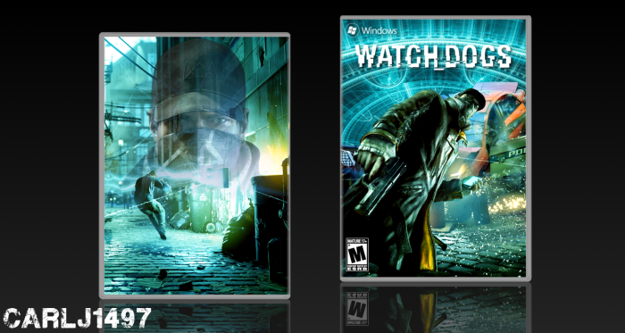
Advertising on other boxes is not taken lightly here and I recommend you stop. As for the box it looks very nice but I would suggest not getting too fond of changing colors and making a minimalist backs.
@Deathmania But I hate doing official looking backs! I hate it! And also, I've been doing more than just changing colors. My boxes are made up of a lot of pictures, cut out and adjusted to fit together.
@Carlj1497 I am aware of that but colours is the driving force and while that is good, you really gotto try something else. Your recent work is very similar and is most likely getting old to some people.
I actually like the colors, since it feels a lot different then other W_D boxes. My only complaint is the back. I realize you like doing something simple and not quite official, but you would benefit more doing the latter when it comes to actually improving rather than not getting back anything in the process of making them.
I'm not fond of the overlay of the dude's face on the back. I think it's just because it looks out of place. I don't think I would have minded it so much if it was smaller, a little more opaque and some kind of summary was added to balance it out.
 Watch Dogs Box Cover Comments
hfdhjasbfyewsbauklfb
(I lost my eyeballs!)
[ Reply ]
u should see my work dude
[ Reply ]
You can't advertise on other peoples boxes.
[ Reply ]
Advertising on other boxes is not taken lightly here and I recommend you stop. As for the box it looks very nice but I would suggest not getting too fond of changing colors and making a minimalist backs.
[ Reply ]
@Deathmania But I hate doing official looking backs! I hate it! And also, I've been doing more than just changing colors. My boxes are made up of a lot of pictures, cut out and adjusted to fit together.
[ Reply ]
@Carlj1497 I am aware of that but colours is the driving force and while that is good, you really gotto try something else. Your recent work is very similar and is most likely getting old to some people.
[ Reply ]
@Deathmania This. I used to HATE doing "official" backs. Now I like how they come out better.
[ Reply ]
Well I've got a few more boxes that I made that have different collor effects. So i'll see how they go
[ Reply ]
Both front and back Suitable for "front". :D
but totally I like it.
[ Reply ]
I actually like the colors, since it feels a lot different then other W_D boxes. My only complaint is the back. I realize you like doing something simple and not quite official, but you would benefit more doing the latter when it comes to actually improving rather than not getting back anything in the process of making them.
I'm not fond of the overlay of the dude's face on the back. I think it's just because it looks out of place. I don't think I would have minded it so much if it was smaller, a little more opaque and some kind of summary was added to balance it out.
[ Reply ]
Nice color scheme and overall good effort.
[ Reply ]
I think your "unoficials backs" would work better with a steelbook template ;)
otherwise good job :)
[ Reply ]