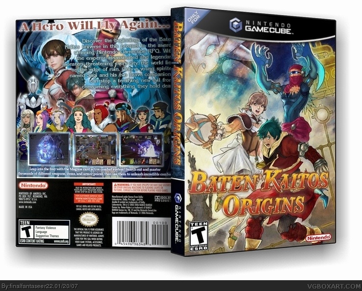
#3, Actually the the amaray 3D was fine on it's own, it's the text being cut off that's the problem.
Now before you made it 3D you couldv'e made the text either smaller and/or moved it a bit to the left to avoid it getting cut off when the spine pops up yet keep it amaray, believe me that tip has helped people.
 Baten Kaitos Origins Box Cover Comments
RAWR
[ Reply ]
You're on box art steroids. :)
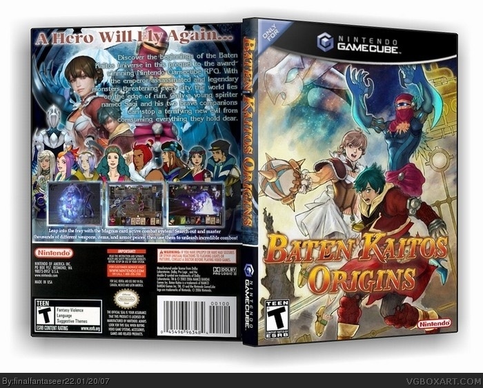
This is again excellent but some of the text is being cut off on the back which can be avoided.
4.5/5.
[ Reply ]
#2, youre the one who told me to use amaray...
ive been using thinkpak.
is i update it to the thinpak will you give me a 5? :D lol
[ Reply ]
v1- amaray
v2- thinpak
[ Reply ]
#3, Actually the the amaray 3D was fine on it's own, it's the text being cut off that's the problem.
Now before you made it 3D you couldv'e made the text either smaller and/or moved it a bit to the left to avoid it getting cut off when the spine pops up yet keep it amaray, believe me that tip has helped people.
And I always rerate boxes.
[ Reply ]
This looks great. I especially like the front and its overall design.
The text on the back though is a bit difficult to read so you may want to try a subtle glow or drop shadow. Again, nice job. 8)
[ Reply ]
Wow, this box looks like it could be the real one. Great job, 5/5
[ Reply ]
Greate!
[ Reply ]