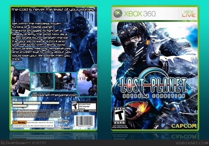
"the cold is never the least of your worries"
...So, the cold is more dangerous than the army of gigantic bugs?
I think it should be "The cold is the least of your worries"
:P
Anyways, I think you may have overdone that glow around the logo I gave you. But everything else is great. 4.5/5
(quiet a bit of text on the back as well, eh?)
#3, no you didn't I added another glow on it to make it stick out a little more, I'll fix the amount of text on the back (again).
I just thought it would be good because the cold in the game can kill you if you don't have enough thermal energy.
#4, thx I used reference from the HUD in the game.
I love the box, however, I always think about this before I finish a box: "Is the back text legible?"
As in: "Is it not boring to read, is it attractive, does it compliment the box?"
The text on the back of THIS box is kinda hard to read and distracts from the screenshots, otherwise, great box DeathSpawn
Very impressive but I don't like the bulky stroke on the back behind the text and now I mention it; it's kind of unnecessary and I don't like the summary font aswell because it reminds me too much of Terminator for some reason nonetheless fantastic job.
4.5/5.
 Lost Planet Box Cover Comments
cred to RB for the logo and Crayon Man for the template.
Enjoy :D
[ Reply ]
Oh my good golly gosh! This is freaking good! 5/5
[ Reply ]
"the cold is never the least of your worries"
...So, the cold is more dangerous than the army of gigantic bugs?
I think it should be "The cold is the least of your worries"
:P
Anyways, I think you may have overdone that glow around the logo I gave you. But everything else is great. 4.5/5
(quiet a bit of text on the back as well, eh?)
[ Reply ]
Sorry for double post, but it sweet how you made those pics in the back in that style.
[ Reply ]
never mind, 5/5. I can tell the amount of effort was immense. And I feel a little generous as well... :P
[ Reply ]
#3, no you didn't I added another glow on it to make it stick out a little more, I'll fix the amount of text on the back (again).
I just thought it would be good because the cold in the game can kill you if you don't have enough thermal energy.
#4, thx I used reference from the HUD in the game.
[ Reply ]
#5, thx I'm still gonna change the cold thing up.
then you can up it to a 5.5/5 :p
[ Reply ]
::| <-- Mr. Alienson says:
Your testing your luck...
[ Reply ]
-/ <-- Cyclopto says "a monkey a day makes you dance more"
[ Reply ]
>:( <---- the Pissed Off Smiley says:
"I can't fucking update it because of a 1 MB limit!!!!!!"
[ Reply ]
::| <-- Mr. Alienson says:
Oh, the profanity!
[ Reply ]
thx for the comments everyone (and by everyone I mean Ninja and RB)
[ Reply ]
#10 -/ <--- Cyclopto says, " That is only like the 10TH time I heard you swear, unlike me"
[ Reply ]
I love the box, however, I always think about this before I finish a box: "Is the back text legible?"
As in: "Is it not boring to read, is it attractive, does it compliment the box?"
The text on the back of THIS box is kinda hard to read and distracts from the screenshots, otherwise, great box DeathSpawn
[ Reply ]
I finitely have to get this game once I get my 360.
[ Reply ]
*definitely
[ Reply ]
wow now i 100% want this game. well done dude.
5/5
[ Reply ]
Very impressive but I don't like the bulky stroke on the back behind the text and now I mention it; it's kind of unnecessary and I don't like the summary font aswell because it reminds me too much of Terminator for some reason nonetheless fantastic job.
4.5/5.
[ Reply ]
i was out today at one of those shops were you can play games on a console pod, this was one of them and it was absolutely fucking brilliant.
[ Reply ]
#18, well I wanted to have the font white bit still stick out. So i'm going to change the font and lower the stroke radius.
[ Reply ]
#20, Sure the text needs a stroke to stand out?
It looks so bold that it could stand out in anything.
Expect a 5 for your update though.
[ Reply ]
well I can't update it here because the 1MB size limit so here it is
link
I hate the 1MB size limit so badly I could think of millions of ways to kill myself with a twig to save myself from the thing....
[ Reply ]
Much better. Also, I think I've found a better way to cut out the LP logo, want me to send it to you if I get it?
[ Reply ]
#23, no thx I think its good the way it is
[ Reply ]
It's a Shame you can't update it on the site but you still deserve it.
5/5
[ Reply ]
wouldn't this be rated M? the PAL version is 16+ so wouldn't the NTSC equivalent by M?
[ Reply ]
#26, No Mature is suitable for 17 year olds and some older besides this game has already been officially rated teen.
[ Reply ]
#27, oh. i didn't know that. ah who cares, really just lets more people play it.
[ Reply ]
Who rated this a 1.5?!?!
[ Reply ]
#29, whoever that is, they must be KILLED. How dare they insult such a beautiful game and boxart such as this?
[ Reply ]
#30, Someone must hate this game !
Awesome box 5/5
[ Reply ]
#31 hate this game?
how is that possible?
lost planet rules. that's the bottom line.
[ Reply ]
pretty good lookin work,
like somebody else said above,
maybe too much glowing on the front and back texts.
[ Reply ]