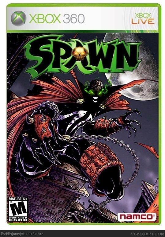
Well this is my newest box and I decided to submit it because no one looked at it in the forums except for Deathspawn. Cred to geobon for the Spawn logo and cmt for the temp. Please view in full and enjoy!
Ill fix that up. The only reason why I used that namco logo because it was on the Spawn Armageddon box so I used that one. Ill fix it up and itll be up in a little bit. Thanks for every one voting!
i think the reason the logos at the bottom look kinda odd (other than the fact that the namco logo looks like the nickelodeon logo) is because the logos are too close to the edges... try to scoot it a LITTLE further away. use other boxes as references.

 Spawn Box Cover Comments
Well this is my newest box and I decided to submit it because no one looked at it in the forums except for Deathspawn. Cred to geobon for the Spawn logo and cmt for the temp. Please view in full and enjoy!
[ Reply ]
I like t a lot! :D Except the ESRB Logo looks a bit odd. 4/5! :D
[ Reply ]
Cool but the namco logo is outdated.
4/5
[ Reply ]
Here a new one
link
[ Reply ]
Actually, that's Crayon Man's logo if i'm not mistaken.
Anyways, great box. But the Konami logo and ESRB logo are odd.
[ Reply ]
#5, Don't you mean Namco ?
[ Reply ]
Ill fix that up. The only reason why I used that namco logo because it was on the Spawn Armageddon box so I used that one. Ill fix it up and itll be up in a little bit. Thanks for every one voting!
[ Reply ]
#6, yeah...Them...I haven't seen a Namco game in a while. :P
[ Reply ]
#5, thats my TEMP, not logo
[ Reply ]
Should I cut out the white part around the logo?
[ Reply ]
#9, Sorry, I thought it was his. Well then, cred to Crayon Man for the temp.
[ Reply ]
UPDATED- I updated everything you guys told me to so here it is!
[ Reply ]
It wont make the M logo smaller when I updated it. Why is that?
[ Reply ]
#9, sorry...I'm very tired... >_<
[ Reply ]
i think the reason the logos at the bottom look kinda odd (other than the fact that the namco logo looks like the nickelodeon logo) is because the logos are too close to the edges... try to scoot it a LITTLE further away. use other boxes as references.
[ Reply ]
the bandai namco logo seems blurry and is a little too far in the corner but i like the cover! good job 4/5
[ Reply ]
#15, #16, Ill get those fixed up. Thanks for your comments!
[ Reply ]
I updated it and move everything up like you said. I think the ESRB looks better now.
[ Reply ]
No one cares anymore?
[ Reply ]
The whole box is good but esrb logo is hmm... cant you make it look clean like namco logo, then it will be excellent
[ Reply ]
#20, Well im trying I dont know how they are supposed to look. Ill try agian.
[ Reply ]
ad an image comics logo
[ Reply ]