![]() »
»
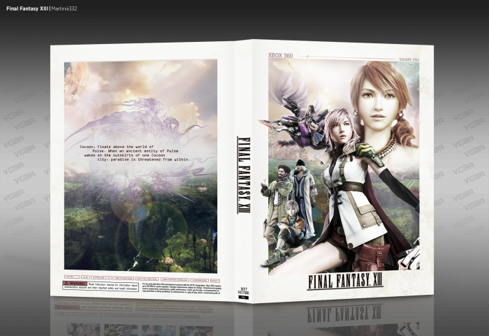
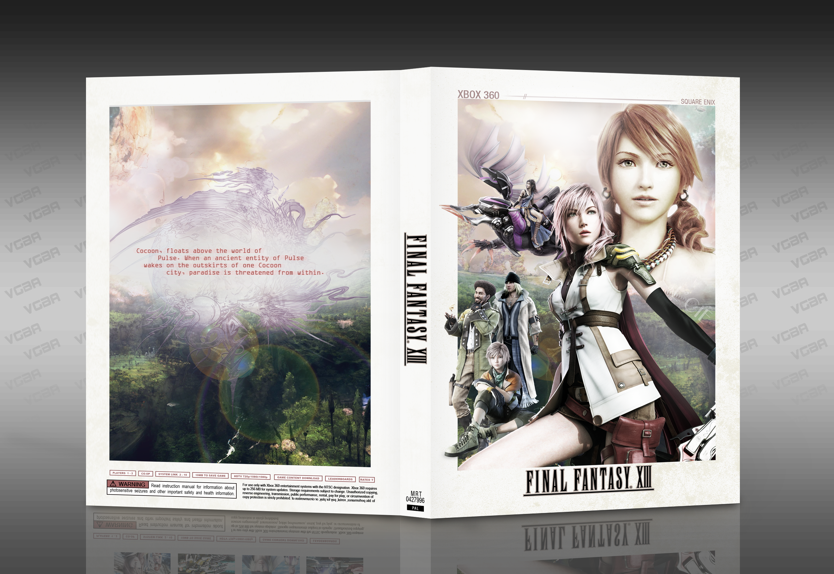
[ Box updated on February 25th, 2014 ] [ original ]
 Final Fantasy XIII Box Cover Comments
Comment on Martiniii332's Final Fantasy XIII Box Art / Cover.
thanks to everyone who gave their ideas in the WiP, you guys are real
[ Reply ]
You really shouldn't have mirrored Hope due to asymmetrical hair, but it looks so bright that it still is good.
[ Reply ]
Yeah, mirroring one of my pet peeves too, but I thought it fit so well I had to make an exception for it. Thanks.
[ Reply ]
Great job, I like the simplistic back
[ Reply ]
Not overly sure about the red font on the back there, but I love the rest of it.
[ Reply ]
this is an excellent cover! :)
[ Reply ]
Damn thats good
[ Reply ]
Looks great. I like the simple white border, the minimalistic back. The only thing I dislike is the font of the text on the back. Maybe a more calligraphy style would fit better? I don't like this computer style font.
[ Reply ]
Loving it elegant and creative, not too fond of the red text to the back, but still awesome stuff
[ Reply ]
I really like this a lot. Especially how simple and elegant it looks. But, just as someone else mentioned, not too sure about that color for the text on the back.
[ Reply ]
excellent Martiniii332
[ Reply ]
I actually gasped when I saw the thumbnail. This is beyond beautiful.
[ Reply ]
nice man.
[ Reply ]
Thank you, everyone.
I'm thinking of changing the color of the red text as soon as I get the chance.
[ Reply ]
Updated with black text on the back.
[ Reply ]
Wow! Lovely work.
[ Reply ]
beauutiul
[ Reply ]
It looks very nice, congrats Martin
[ Reply ]
congrats , very nice work
[ Reply ]
looks amazing, congrats
[ Reply ]
I'm a bit shocked that this wasn't in the HoF sooner, but better late than never. Congrats!
[ Reply ]