It kinda bluey-green. I like this box. The front is spectacular, but the rear leaves some room for improvement. I am not sure if the text is clear enough, in a fitting font.
#3, #4, Im glad that you like how i put front together and for blurry, I always use HUGE number of adjustment layers so that all pictures that have difernt styles look good together, but the more adjustment layers you use the compression makes it worse
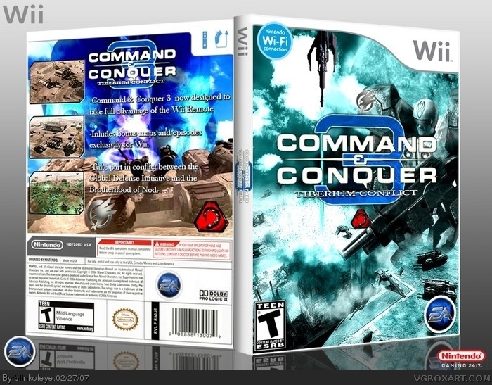
 Command & Conquer 3: Tiberium Conflict Box Cover Comments
You know how EA is making special version of Godfather for Wii, well this is special version of C&C3 for Wii. Like StarCraft64 was for Nintendo64
[ Reply ]
I like it, except for the fact that its blue, when tiberium is green. still good though, just an interesting choice of colors
[ Reply ]
#2, yeah i did that on purpose, just Wii version, nothing else
[ Reply ]
It kinda bluey-green. I like this box. The front is spectacular, but the rear leaves some room for improvement. I am not sure if the text is clear enough, in a fitting font.
[ Reply ]
#3, #4, Im glad that you like how i put front together and for blurry, I always use HUGE number of adjustment layers so that all pictures that have difernt styles look good together, but the more adjustment layers you use the compression makes it worse
[ Reply ]
WOW! This is awesome, and an easy 5/5!
[ Reply ]
you have become one of the site's best members.
[ Reply ]
WOW....a ture boxart has been born 5/5 .
[ Reply ]
nice front. although you can't really make out any picture and the logo is oddly placed. the back sucks.
[ Reply ]
#9, are you still here!
[ Reply ]
@ All : It exists Green AND Blue Tib :)
[ Reply ]
*erects a statue dedicated to your awesomeness*
[ Reply ]
#12, When I saw the word "erect", I...
Never mind.
[ Reply ]
Fav'd, dude it looks awesome.
[ Reply ]
Have a good title call Command Conquer 3 Tiberium Wars Wii Edition
[ Reply ]