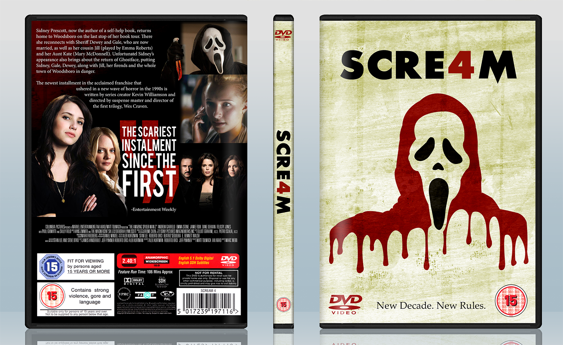
I was originally going to remake an old box I did before and just update it but I decided not to waste any more time.
[ Box updated on May 29th, 2014 ] [ original ]
 Scream 4 Box Cover Comments
Comment on Legend_Chronicles2's Scream 4 Box Art / Cover.
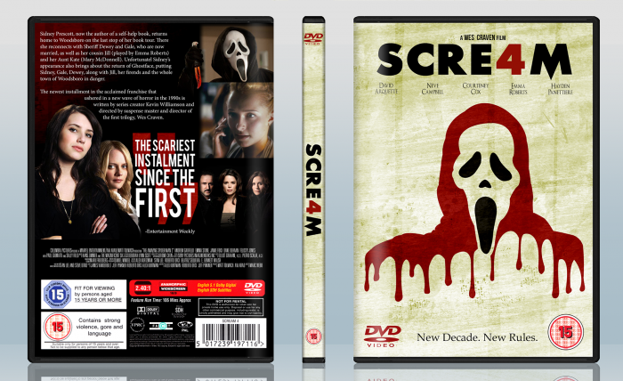
Use of red to break out in the front looks good. Would have liked it if you kept the same style of the box for the back though, an abrupt change in style. Good work overall.
[ Reply ]
exactly right ;)
[ Reply ]
I like it a lot, but both the front/spine and back lack anything to unfiy them as @rob2197 mentioned. It would have worked better if you bought some of the front elements to the back to keep the consistency.
Maybe consider making a new front/spine and treating the existing one as a slipcover? That way, the back could be just that yellow-ish texture of the slip. You can even create an illusion of a die-cut for the barcode area of the slipcover to bring in the elements of the black you have going on through the front to tie things together. Just some suggestions to make everything work together.
Good job though. Like the treatment of the quote and the cutout characters next to it on the back especially.
[ Reply ]
Thanks for the feedback and likes. To address the comments mentioning that the back doesn't match, it's something that I noticed but ignored. I thought the back would look too messy or overdone if I didn't go with a solid black but you've given me new ideas.
I'll take your advice into consideration.
Ohhh, just noticed I forgot to put the actors'/director's names on the front.
[ Reply ]