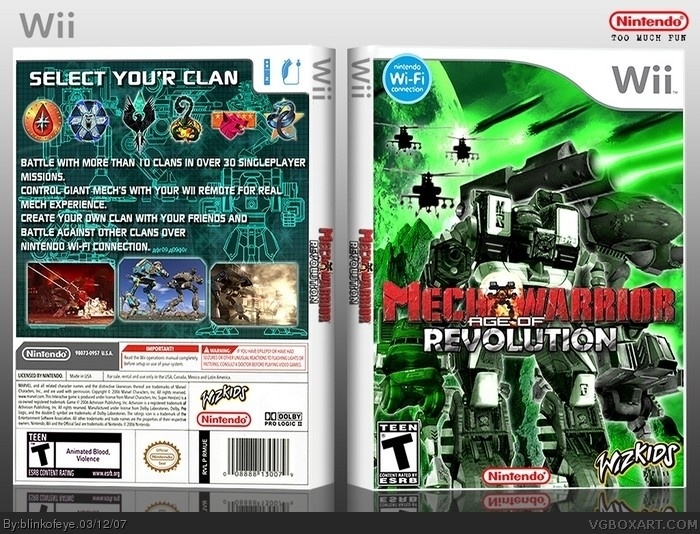
i agree with #2, the back is great, very smart composition.
the front is wonderful as well (i presume you worked your blending magic ;) ), the only thing is that the logo could possibly use some sharpening or something to stick out more.
wow site really must be clean now. I have posted this box 2 days ago and its still on front page. I remember when i used to post box and than 30 min later its of from front page
 MechWarrior: Age of Revolution Box Cover Comments
I dont know what to say, really
[ Reply ]
Great job, again! The front is really neat, and the back is displayed very professionally.
[ Reply ]
i agree with #2, the back is great, very smart composition.
the front is wonderful as well (i presume you worked your blending magic ;) ), the only thing is that the logo could possibly use some sharpening or something to stick out more.
[ Reply ]
Reminds me of Zoids....nice job!
[ Reply ]
thanks bob, koopa and finalfantaseer22(whats short of this) and i will see what i can do with logo
[ Reply ]
Great job .
[ Reply ]
wow site really must be clean now. I have posted this box 2 days ago and its still on front page. I remember when i used to post box and than 30 min later its of from front page
[ Reply ]
how come you spellt "your" wrong? you spelt it with an apostrophe, which is incorrect.
this is an amazing box nevertheless.
[ Reply ]
#8, what can i say, oops
[ Reply ]
I love it. I just can´t say more. 10/5
[ Reply ]
11/10
[ Reply ]
Prefer MechAssault but still love the box 10/10
[ Reply ]