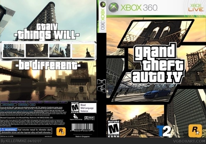
nope not good. the front is just a bunch of badly placed screens with big black outlines on them. the back is just plain old plain, and wtf is up with the inverted colors on the info on the bottom? its also very blurry down there too. another flaw is how the black part of the spine is too wide and can be see left of the 360 part on the spine. all the pictures are blurry too. last but not least you used the wrong logo..........
have a nice day :D
 Grand Theft Auto IV Box Cover Comments
credit to crayonman for the temp.
[ Reply ]
i notice at the top of the front that the pic doesnt touch the top.sorry about that.
[ Reply ]
No
[ Reply ]
what?
[ Reply ]
It's ok, but I just don't like it. 3/5.
[ Reply ]
nope not good. the front is just a bunch of badly placed screens with big black outlines on them. the back is just plain old plain, and wtf is up with the inverted colors on the info on the bottom? its also very blurry down there too. another flaw is how the black part of the spine is too wide and can be see left of the 360 part on the spine. all the pictures are blurry too. last but not least you used the wrong logo..........
have a nice day :D
[ Reply ]