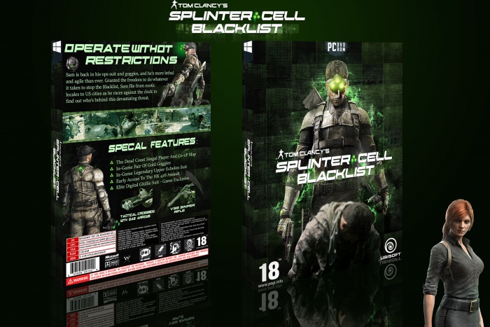
Hi this is my 4th box.hope you will like it
[ Box updated on March 9th, 2015 ] [ original ]
 Splinter Cell Blacklist Box Cover Comments
Comment on satish's Splinter Cell Blacklist Box Art / Cover.
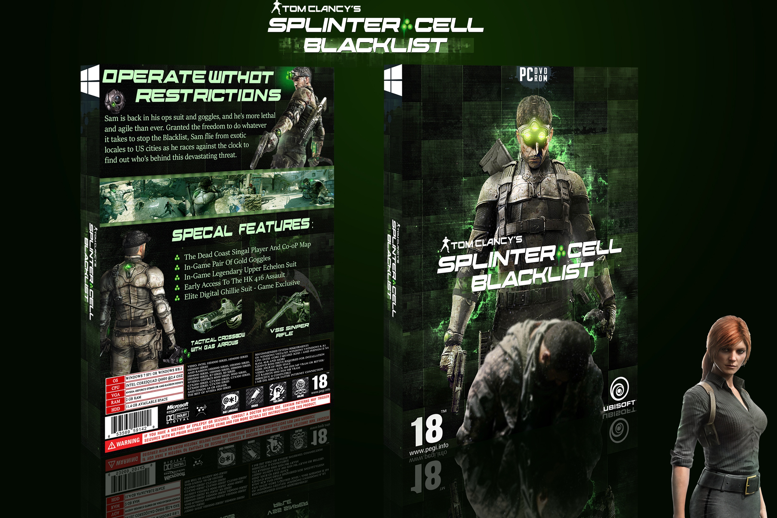
Hi this is my 4th box.hope you will like it
[ Box updated on March 9th, 2015 ] [ original ]
Comment on satish's Splinter Cell Blacklist Box Art / Cover.
nice work you getting better , I think Window 10 logo you use is a little big , & you must change some fonts too , I like presentation and texture and some other fonts and renders and logos you use in this cover , keep it up :)
[ Reply ]
thanks
[ Reply ]
nice satish
keep it up man your starting better
[ Reply ]
Thanks
[ Reply ]
WELL DONE MY FRIEND. VERY VERY NICE AND I LIKE THIS ONE SO MUCH. KEEP IT UP
[ Reply ]
Thanks HB
[ Reply ]
nice
[ Reply ]
Thanks
[ Reply ]
mybe your delete or resize Windows 10 logo ,because iman pro bro says little big,ı agree with him.and mybe delete the girls render.but its a nice work bro.
[ Reply ]
Thanks dark frost
[ Reply ]
Did you make this with your friends again? I prefer the structue on the back compared to your other cases. Also I quite like the effect on the front. So good work on that.
I think the tag line and text below are quite close to the edge on the back. The front I think the dead man looks a bit strange. it looks like he has fallen over dead at waist height
[ Reply ]
Thanks and soon I fixed it
[ Reply ]
now fix logo.
[ Reply ]
Nice organization. The colors are on point and fit the game. The main problem here is the quality. Its pretty blurry in fully size.
[ Reply ]
Thanks jevangod
[ Reply ]