Not bad at all. As suggestions go, I would make the render of Spongebob bigger, and maybe add more characters. And remove the second Nick logo at the top, there's no need for that one. Other than that this looks good.
go for some different ...the logo of front is on the template of the nick and it is on the top the text on the back are too small.try some more effort good luck
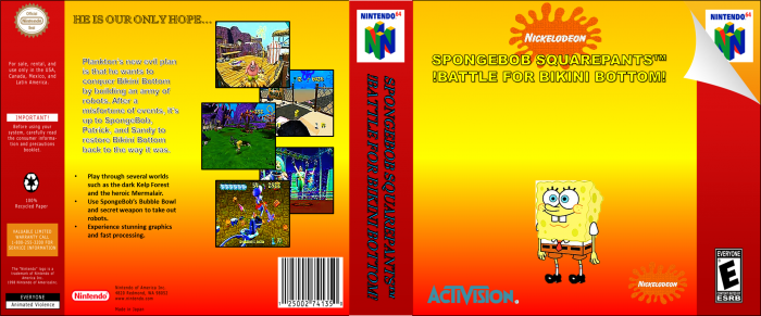
 Battle for Bikini Bottom Box Cover Comments
Not bad at all. As suggestions go, I would make the render of Spongebob bigger, and maybe add more characters. And remove the second Nick logo at the top, there's no need for that one. Other than that this looks good.
[ Reply ]
go for some different ...the logo of front is on the template of the nick and it is on the top the text on the back are too small.try some more effort good luck
[ Reply ]