Hey!
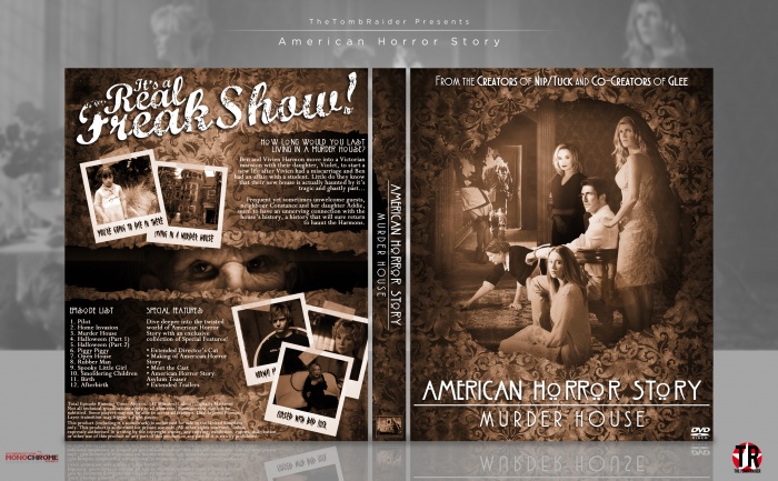
Here's my entry for the second round of Octoberfest. I only recently got into this series, but holy shit it's addictive.
Thanks to Paper for the feedback in the WIP, I would wait longer for more feedback but I'm a little too busy with exams.
Thanks for looking ^^
Good luck to the other entrants.
 American Horror Story: Murder House Box Cover Comments
Comment on TheTombRaider's American Horror Story: Murder House Box Art / Cover.

wow nice very nice
good luck for comp :)
[ Reply ]
Thanks ^^
[ Reply ]
Nice work, fav to you :)
[ Reply ]
Thank you :)
[ Reply ]
I'm not really a fan of the show (not that it's bad, by any means, it's surely a lot better than Scream Queens, ugh), but the box looks quite nice and fits the theme quite well. Good job, Nathan! :)
[ Reply ]
... I love Scream Queens xD
Thanks Frank ^^
[ Reply ]
@TheTombRaider Lemme guess, is it because Ariana's in it? xD
Nah, for real, though. The show just seemed so try-hard funny it became cringe-inducing to me, like I know it's supposed to tackle on the horror cliches, much like Until Dawn, but that played them off better than that show. That being said, AHS looks like it handles that better because of the serious tone of it.
/rant over
[ Reply ]
@FrankBedbroken Yeah I get you, and yes, it is because Ariana's in it xD
The show itself isn't bad, it did make me laugh quite a lot (since it's a comedic horror) but it is packed full of cliches. Until Dawn is full of them too but I didn't really mind. AHS isn't too bad for horror cliches, I'd say it's more of a 'fucking weird' than a horror.
[ Reply ]
Not bad
[ Reply ]
Very leatring box
[ Reply ]
@arno keep it up man
[ Reply ]
Love what you've done here with textures and colour, looks very official. Nice job and good luck in the comp!
[ Reply ]
Thanks Mat! :)
[ Reply ]
I loved the first two seasons of this show. The other three were different (not bad) and I still liked them. Anyway, this is a great cover, good luck in the competition!
[ Reply ]
Thanks! ^^
[ Reply ]
Good Stuff TR! as I said in the WIP Thread, I really like the structure and colour scheme and your typography is getting better with each box, keep it up man!
[ Reply ]
Thanks! ^^
[ Reply ]
Good job! However I do have a few complaints. I'm not sure if you knew this since you just started the show but all the seasons have completely different and unrelated storylines, they just use the same actors. You used the wrong image of Jessica Lange on the front and in one of the screenshots on the back, that's her character from Coven and her Murder House character looks a lot different aesthetically. It probably would have made more sense to use Evan Peters character in her place on the front as well.
The layout of everything is nice but the headline on the back is REALLY killing it for me, the font choice doesn't match at all and I don't understand why you'd choose "It's a real freak show" since the 4th season of AHS is Freakshow.
Everything else seems to be in order but the incorrect characters and ugly headline are really killing the vibe for me as an AHS fan.
[ Reply ]
Yeah I get you, and I respect you're opinion. I'm not familiar enough with the serious yet to know the differences, although I am aware of the 4th series having the title "Freak Show" and yeah I should've changed that. But I couldn't think of anything else to put :3
Thanks for the feedback though! It's highly appreciated! :)
[ Reply ]
Wow I love this design man. I really like the tag line and backcover. Front is good too, just prefwer the back. Havent seen the show but the case looks great.
[ Reply ]
Thanks a lot Vince! :)
[ Reply ]
Really tastes the series , great job :")
[ Reply ]
Thanks Amia :)
[ Reply ]
This is fantastic, great layout on the back.
[ Reply ]
thanks ^^
[ Reply ]