good but no that good, the front looks awesome, but the back.... well the two pics are together( that dosent look good) and i know the blur was on purpose but i dosent look good( i think) and the text dosent have a good font and is hard to see. so ill give you a 2.5/5
 Burnout: Carnage Box Cover Comments
Credit to Dark_Shadow for cutting out my logo and The Employer for the template.
I worked hard on this. Please don't be harsh, I am not very experienced.
[ Reply ]
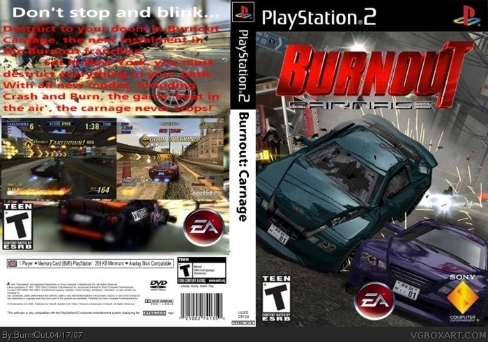
The front is cool but the back is super blurry and the lower back is from PAL Box .
3/5 for effort .
[ Reply ]
#2, the pics are meant to be blurry, if that's what you mean...
[ Reply ]
front is cool. back, not so much.
#2, it's not from a PAL box, it says NSTC.
[ Reply ]
#4, I thought it was PAL because the flag looks a flag from europe .
[ Reply ]
good but no that good, the front looks awesome, but the back.... well the two pics are together( that dosent look good) and i know the blur was on purpose but i dosent look good( i think) and the text dosent have a good font and is hard to see. so ill give you a 2.5/5
[ Reply ]
the front was very nice
the back kinda killed it with the blurry pic and the dodgy writing
[ Reply ]