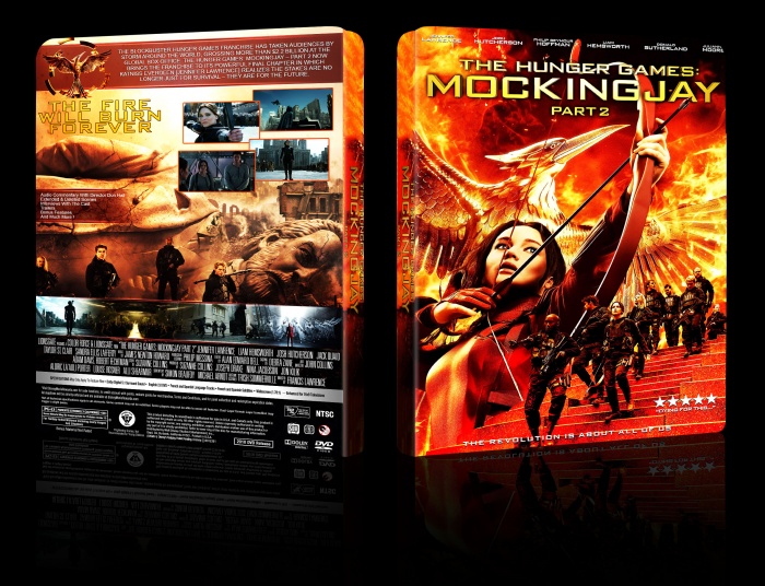
Again Again Again Thanks For Template link
[ Box updated on March 9th, 2016 ] [ original ]
 The Hunger Games: Mockingjay - Part 2 Box Cover Comments
Comment on tflash's The Hunger Games: Mockingjay - Part 2 Box Art / Cover.

This is awesome. I wonder what it would look like if you slightly desaturated everything behind the main Katniss image to fit the light background of the top half of the back. I'm also not too big of a fan of the tagline's treatment, but I see why you did it like that. I like seeing good Hunger Games covers here, there are not many.
[ Reply ]
^this, good work man
[ Reply ]
i really like the front ;)
[ Reply ]
Great layout and strong colours! :D
[ Reply ]
nice design and structure
[ Reply ]
Nice work
[ Reply ]