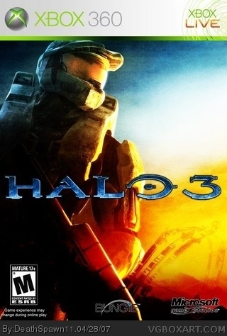
cred to crayon man for the temp. PLEASE VIEW IN FULL VIEW!!!! and I don't want anywone to say I slapped a logo and stuff on, cause I edited a lot of this I had to cut, and paste the broken Halo thing out and put it in with MC then do some adjustments. look at the official wallpaper then compare to this you'll see that they're very different.
#4, just wait until the game comes out, everyone and their brother will be postin Halo 3 arts. very nice tho, but i agree with #6, the logos are bad so a 4/5
soo.... deathspwan this was thy project!!! you just oblirated the one htat i had done and deleted, this is soooo awesome, another awesome box by deathspawn!!! im just not going o give it a 5/5 because of the microsoft and bungie logo, they r a bit strange... so i give you a 4.7/5
i am also fed up with halo 3 boxes, but the effects and colors are interesting so its not so bad, however, man, those logos sure look weird...
except for the region logo, which you forgot to include...
 Halo 3 Box Cover Comments
not another halo 3 box, but this 1 is different isnt it. only thing i dont like is the devolper logos they arent cropped well. nice overall though 4/5
[ Reply ]
cred to crayon man for the temp. PLEASE VIEW IN FULL VIEW!!!! and I don't want anywone to say I slapped a logo and stuff on, cause I edited a lot of this I had to cut, and paste the broken Halo thing out and put it in with MC then do some adjustments. look at the official wallpaper then compare to this you'll see that they're very different.
[ Reply ]
I told you to use white!! The logos look awful with a white stroke around them!! Put two more seconds in and use white!!
[ Reply ]
I'm obviously really, really fed up with Halo 3 boxes but I'll let you off just because this is so dang nice in full size. :p
[ Reply ]
#4, this is on;y the beginning my friend.... just wait until they release more new art, then the real danger will commence o_O
[ Reply ]
I really like this box. The dark, mature feel makes for an apocalyptic setting that is perfect for the game.
8/10, because the dev logos aren't cropped well.
[ Reply ]
See? I told you...you should have gone with white...
[ Reply ]
#4, just wait until the game comes out, everyone and their brother will be postin Halo 3 arts. very nice tho, but i agree with #6, the logos are bad so a 4/5
[ Reply ]
soo.... deathspwan this was thy project!!! you just oblirated the one htat i had done and deleted, this is soooo awesome, another awesome box by deathspawn!!! im just not going o give it a 5/5 because of the microsoft and bungie logo, they r a bit strange... so i give you a 4.7/5
[ Reply ]
wow awesome
[ Reply ]
another thing can you send me the high res version you have of this wallpaper??
[ Reply ]
i am also fed up with halo 3 boxes, but the effects and colors are interesting so its not so bad, however, man, those logos sure look weird...
except for the region logo, which you forgot to include...
[ Reply ]