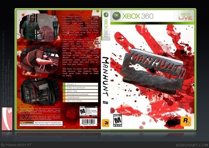
Third box, not much to say. Lots of blood this time. :P Still being minimalistic as that's what I like to see in box art. I hate it when companies overuse every and all images that have just to cram as much crap onto a cover as they can.
I might make a limited edition of this cover or something later.
#3, You're right, it's not the official logo. I'm going to put that on it and see how it looks with the rest of the theme. I don't think the compression has done anything to the image as I saved it at quality 12 (highest). Unless VGB does something with it when it's uploaded.
 Manhunt 2 Box Cover Comments
Third box, not much to say. Lots of blood this time. :P Still being minimalistic as that's what I like to see in box art. I hate it when companies overuse every and all images that have just to cram as much crap onto a cover as they can.
I might make a limited edition of this cover or something later.
[ Reply ]
simply awesome 4.5/5
[ Reply ]
well done, but there's alot of red so the compression may have ruinned it a bit... but also, i'm not so sure that's the official logo...
[ Reply ]
I like it, very creative.
[ Reply ]
#3, You're right, it's not the official logo. I'm going to put that on it and see how it looks with the rest of the theme. I don't think the compression has done anything to the image as I saved it at quality 12 (highest). Unless VGB does something with it when it's uploaded.
#2 and #4, thank you for your comments. :)
[ Reply ]