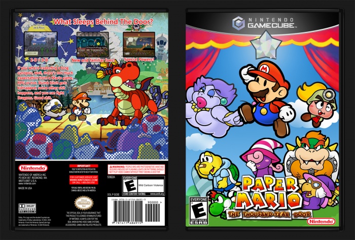
This was intended to be just a quick and easy cover, but I needed to put much more work into it than intended. The background on the front was poor resolution, so I ended up making my own, though, unfortunately, you can't really see it. Full size, because I think it turned out nice. link
Like it or lump it, I made something.
Edit: oh yeah, Vivian's pose was custom, also.
Edit 2: FUCK the update button on this site, man. Changed the back slightly. For full size click here: link. Printable added, as well.
The Vivian render, if anyone's interested. link
[ Box updated on February 28th, 2018 ] [ original ]
 Paper Mario: The Thousand-Year Door Box Cover Comments
Comment on Sonic the Hedgehog's Paper Mario: The Thousand-Year Door Box Art / Cover.

the yellow font on the back king of gets lost in design of the back, i would have put a colored/textured text box behind it to make it more legible.
Still, looks super cool man, I really like the overall layout of it all. The text stuff is kind of a nitpick.
[ Reply ]
Thank you, I may tinker with it when I get home.
[ Reply ]
^ This.
But also,I'd make the screenshots more central and or make each of them wider to fill the empty space around them.
[ Reply ]
I like the update, though it isn't quite what i had in mind it is much nicer. The colors flow much better and it catches the eye. Nothing is lost, everything that needs to stand out does.
[ Reply ]
candy style :D
[ Reply ]
Nice update. Why don't you try using the font in the link for the tagline on the back?
link
For future boxes my only suggestion is try to find a way to keep the text legible other than giving it an outline and drop shadow. This isn't always needed, it depends on what background your typing on, or sometimes the font your using. Thinker fonts might work on more complex backgrounds.
[ Reply ]
it works on this cover IMO
[ Reply ]
I don't like Mario styled fonts on anything but logos. As for the stroke, if I went with a bold style, it would add to the clutter. Plus, to me, it seems most things relating to Paper Mario kind of needs it. The artstyle is heavily reliant on it, of course.
[ Reply ]
I really like this. I love colorful boxarts. Well done! The front looked a bit weird for some reason, and finally I found what caused it, It's missing the "only for Gamecube" thingy lol. Still an amazing job
[ Reply ]
Shit
[ Reply ]
This box is so good I'm literally shitting my pants at this moment
[ Reply ]